
OFF THE CHART: INTERVIEW WITH JOA STUDHOLME OF FARROW & BALL
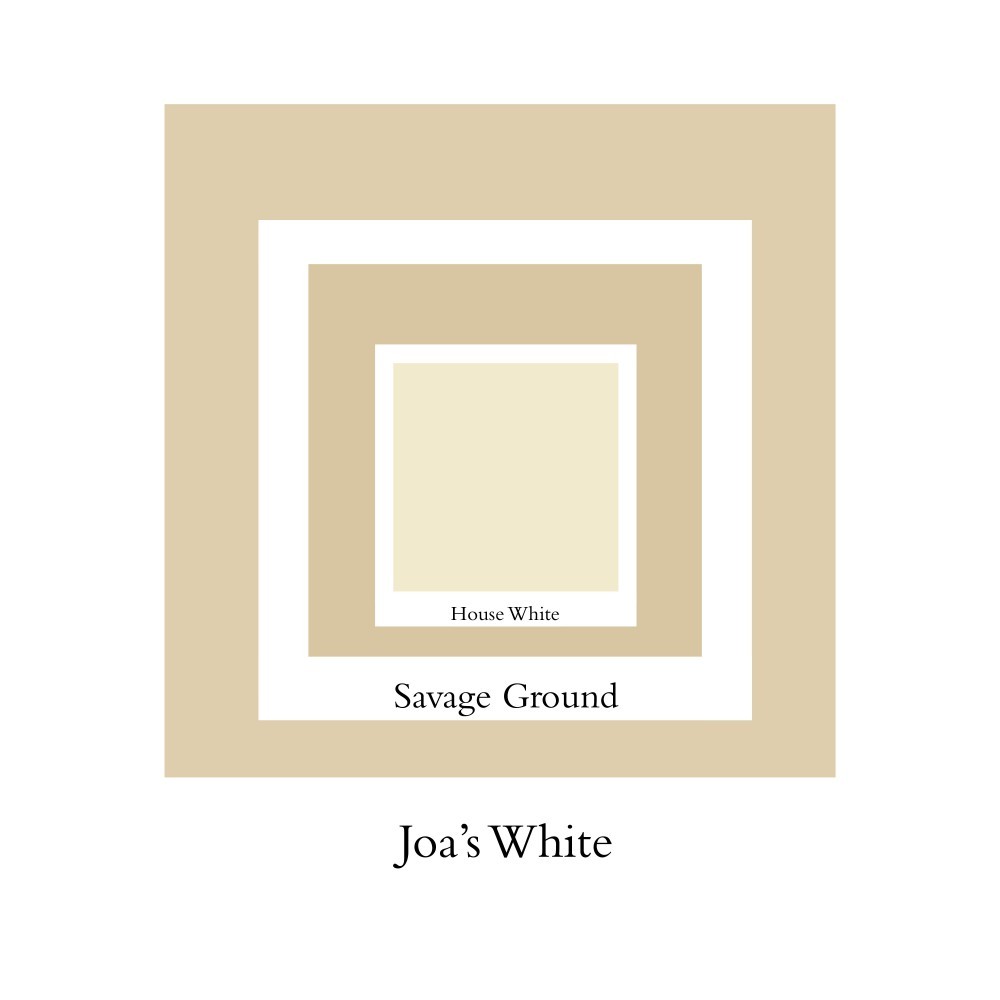
As early as 1810, in his book Theory of Colors, German poet Johann Wolfgang von Goethe linked certain colors with human cognition, assigning specific experiences to their perception. More than 200 years later, Joa Studholme is doing much the same: the color expert for the venerable British paint and wallpaper manufacturer Farrow & Ball is not only responsible for conceiving and naming the company’s chromatic offerings (Joa’s White, a creamy white, was named after her) but she also lectures on the importance of color and how the use of it can improve people’s homes — and lives. PIN–UP caught up with her at Farrow & Ball’s Dorset headquarters for a kaleidoscopic chat.
What would you say is the biggest influence on your work as a color expert?
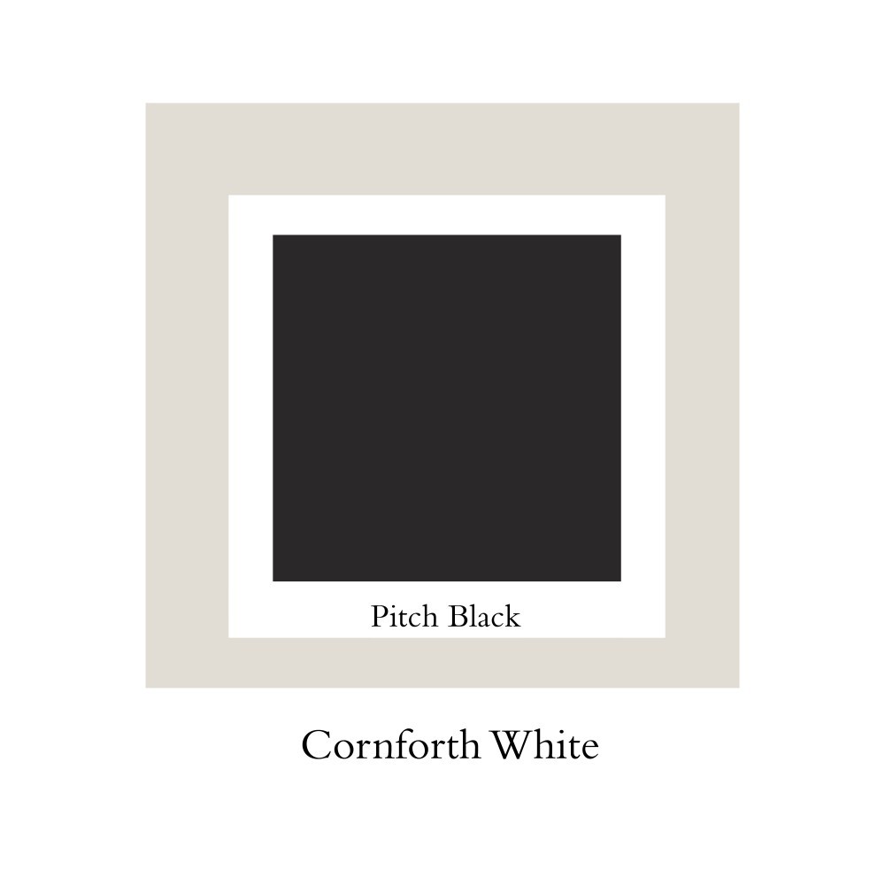
Nature, always! And the world around me, whether it’s going to an art gallery, for example. When it comes to new colors, I’m always looking to see if they fit in any gap. For example, we’ve had a color called Cornforth White, which is extremely popular, and we realized we wanted to make a darker and a lighter version of it. That’s what I call gap filling. But it’s really about our instinct.

How come Farrow & Ball only offers 132 colors at a time?
Because it makes it easier for the customer. We have the neutrals, the reds, the greens, the yellows, the blues… But even if we remove colors they still remain stowed in the archive. In fact, it makes clients feel special using an archive color instead of a color from the card.
How many colors are there in the archive?
Oh, my Goodness! Let’s see… every three years we take nine colors off the card, and I think we’ve done that around 8 times…so I would think we’ve archived at least 80.
Are there any colors you’ve personally had enough of?
That’s quite literally asking which one of my children I wouldn’t want to see again! (Laughs.) Well, I’m pretty keen on getting away from the neutrals, and start using stronger colors again. I mean, in Manhattan it’s almost as if there’s a law that you had to have your house painted grey. (Laughs.) I’m quite grey saturated I’m afraid.
So what’s your color mood right now?
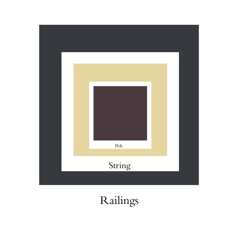
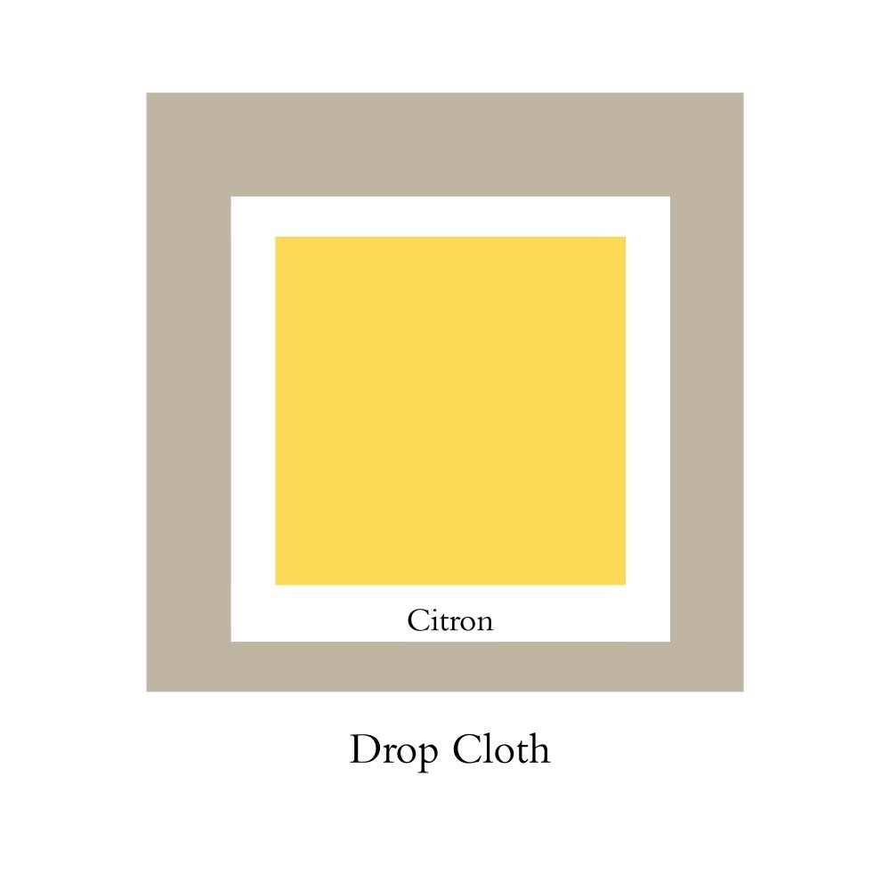
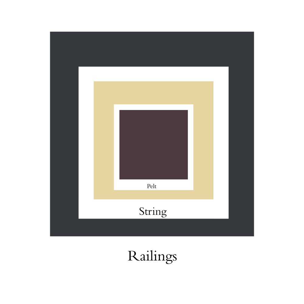
Well, a lot of people are using darker colors too, including blacks. There is Railings, which is not quite black because it’s got a lot of blue in it. So, I’m looking at dark colors with just a taint of something else in it. You know, a blue-black or a green-black or a red-black. Those are very interesting right now. For the exterior of a house, it depends where your house is, but we have a color called Drop Cloth which is very discreet, contemporary, and anonymous. As for the inside of the house, the world is your oyster, really!
Is there one color that drove you a little mad whilst creating it?
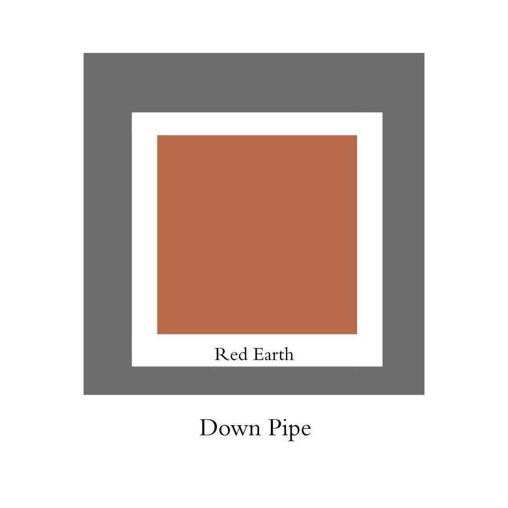
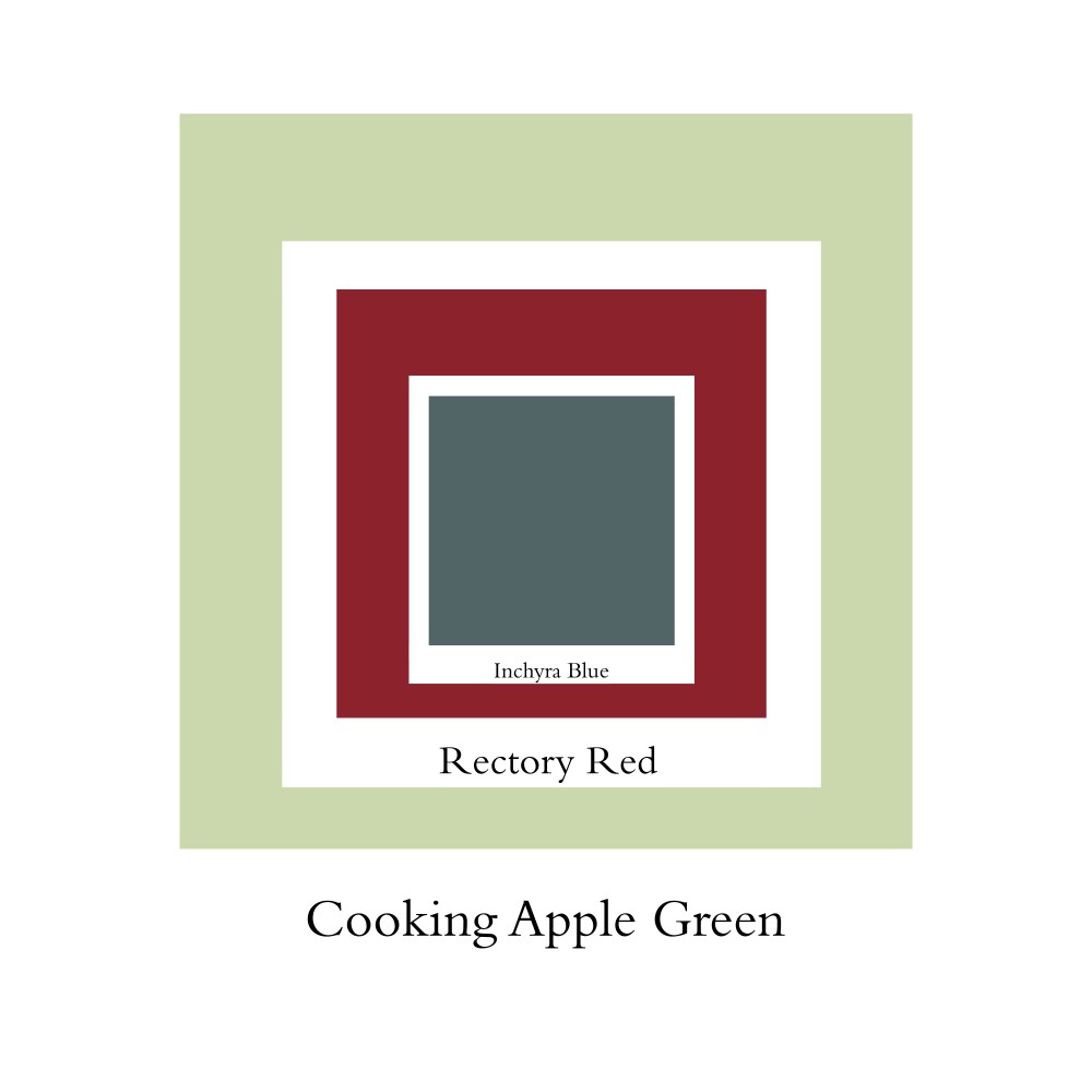
There is one color… It’s called Inchyra Blue. I made it initially to be an alternative to charcoal colors, because everyone just started using Down Pipe. I love Inchyra Blue because it’s very complex. You cannot tell whether it’s a blue, a green or a grey, and I love that! Everyone can interpret it differently. That’s one of the colors I really liked conceiving because it ended up being exactly what I wanted to make and in a very complex way.
To what extent do you think color can provide solace or comfort?
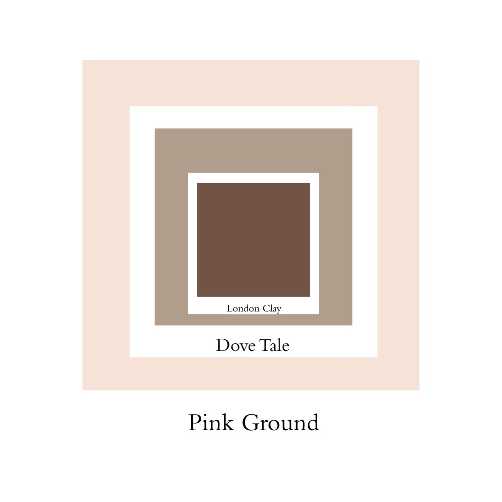
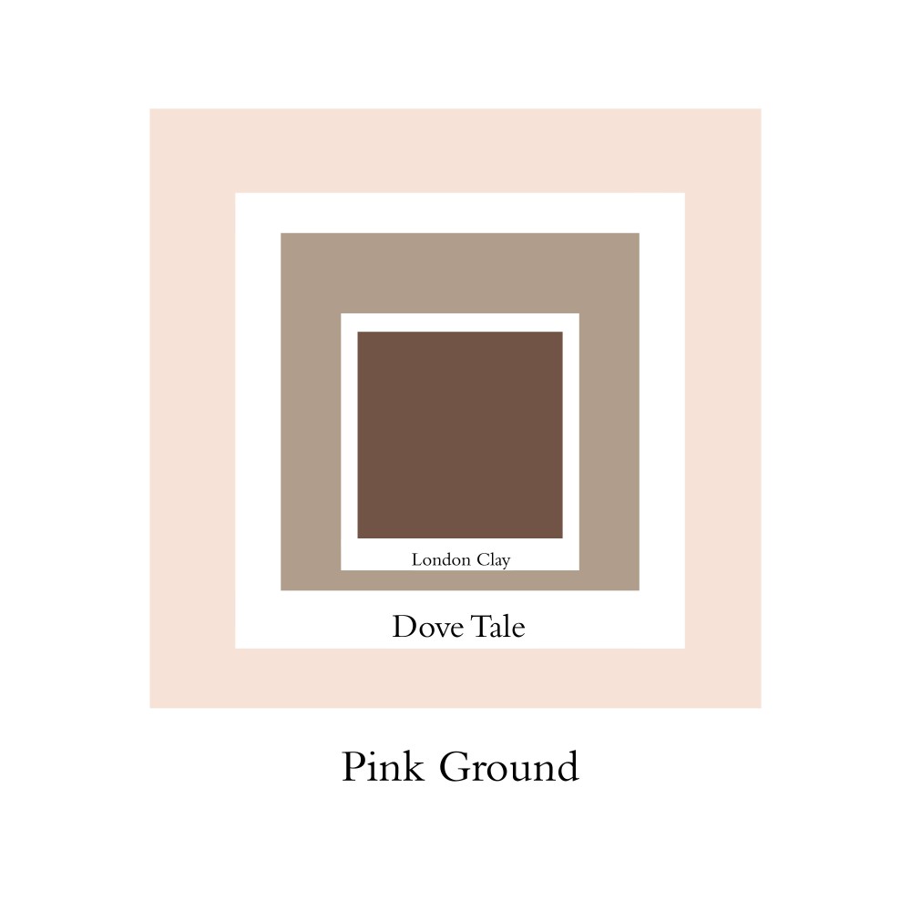
You know, we’re constantly surrounded by flat screens, and smartphones, and people rushing everywhere, and of course the madness of politics etc. So the colors which the people have been attracted over the last few years are the very tender, blushing pinks — the two colors in questions are called Pink Ground and Setting Plaster. When you have them around your house, they’ll feel like you’re just been given a great, big hug. Another thing is, this year, green has very come to the fore. It is obviously connected with the environment, but it also has a protective aspect to it that gives you security. So, I think that what happens in the world affects our choice of colors.
Do you have a favorite color in nature?
I think I will always go back to pinks. But, very washed out pinks. I think they are beautiful.
Is there a particular city that inspires you, color-wise?
Amsterdam is the city for color, for me, because of the colors they actually use on the buildings. But, you could say the same of Notting Hill in London where I live and grew up. Every house is a different color. And it’s not that one person comes in and paints their house yellow and the next to it is blue. In most of the streets that I know, people get together and decide what colors to paint their homes so it looks great. So, I’ve always been excited about the colors in these two places. And then, of course, what could be more exciting than the colors in India?
As a parent and color expert, what would you advise to someone who doesn’t want to comply with the pink for girls and blue for boys “rule”?
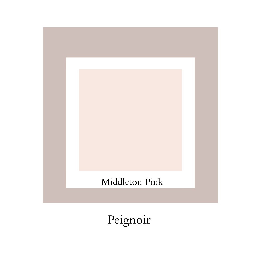
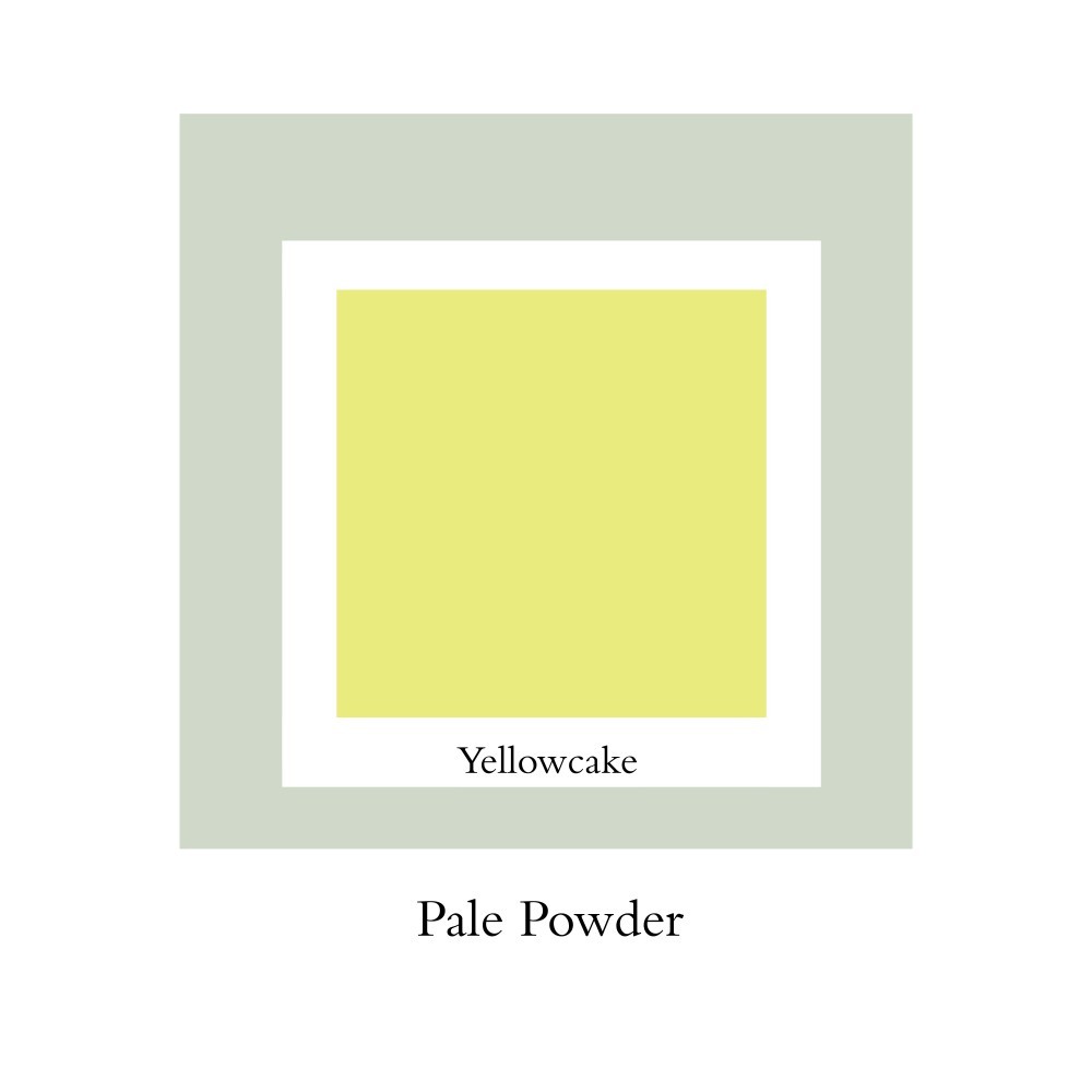
I couldn’t agree with you more: colors shouldn’t be gender-specific! I once made a pink called Peignoir. We created it to prove that it wasn’t just a girl’s color. It was made with a big, big dose of black in it so it didn’t have that sugary, candy feel to it. It’s a pink that is very acceptable for all genders. There is also a color called Pale Powder that little girls love. But we always try to create colors that appeal to all genders. And my own children don't have anything to worry about. Their rooms are repainted three or four times a year, because I love to redecorate. (Laughs.)
I heard you are also a fan of African prints?
Indeed, I buy lots and lots of African prints! There are a lot of markets here in London where they’re sold, and quite often I would have cushions or blinds made in the same fabrics, which sometimes is a little bit embarrassing. I’m merging with my own house!
What color combination is the hardest to match?
I think the hardest colors to go together are blue and yellow, I really do. And, it’s is extraordinary because if you think about being at the beach and you have the blue of the sea and the sky and the yellow of the sun, it’s beautiful! But, in painting, it’s very difficult to mix blue and yellow and not end up looking like an IKEA sign. (Laughs.)
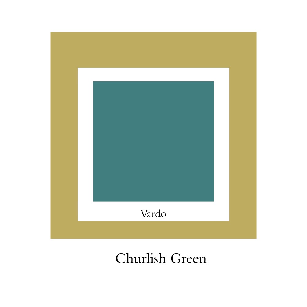
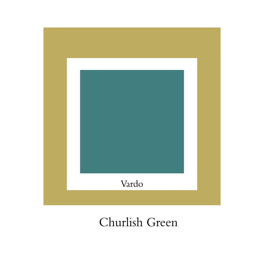
**And what is the worst color I could paint my bathroom in?
**Churlish Green! Whatever light you put with it, it makes you look ill. In a bigger space, it’s fine though. But, once I tried to paint one of my children’s bathroom to make it look like a sort of 1950s caravan, so I put that color, in gloss, and it looked exactly like a 1950s caravan, except I had him whisking out of the bath asking to be taken to the doctor because he looked so ill. Inchyra Blue is a fantastic color for a bathroom because it has that element of blue, but it’s so much more chic and sophisticated.
Are there any artists, interior designers, or fashion designers you admire most for their use of color?
For art, the one that always comes back to mind is Mark Rothko. He is just so inspiring! For interiors what I love are the very traditional British designers, like David Hicks and John Fowler. He was the greatest colorist of his generation. And for fashion I love the old school, glamourous Italian designers from the 1960s. Who doesn’t love a good Valentino red?
Text by Pierre A. M’Pelé.
Collages by Nazli Ercan.