Jonathan Olivares Gets His Rocks Off With a BRAND NEW Fabric Collection
In early 2016 Mohsen Mostafavi, the Dean of the Harvard GSD, asked industrial designer Jonathan Olivares to create a piece of furniture for the Philip Johnson Thesis House on Ash Street in Cambridge, a 1942 precursor to Johnson’s famous Glass House. Olivares accepted, challenging himself with the most iconic piece in the home’s original floorplan: Mies van der Rohe’s Barcelona daybed. Olivares’s tribute to the design classic was made entirely of carbon fiber and covered in a carbon fiber twill weave exclusively produced by the Danish textile manufacturer Kvadrat. Based on the success of the collaboration, Kvadrat asked Olivares to develop it into a full line with a range of 18 colors, for the coloring of which Olivares let himself be inspired by the hues of minerals. Olivares explained the genesis of the project and his unlikely source material to PIN–UP’s Natalia Torija Nieto.

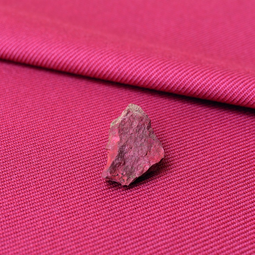
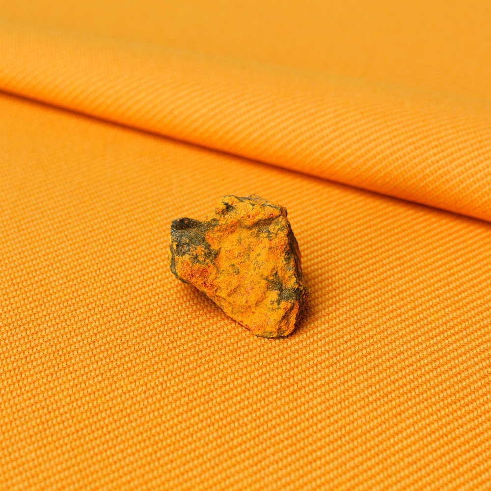
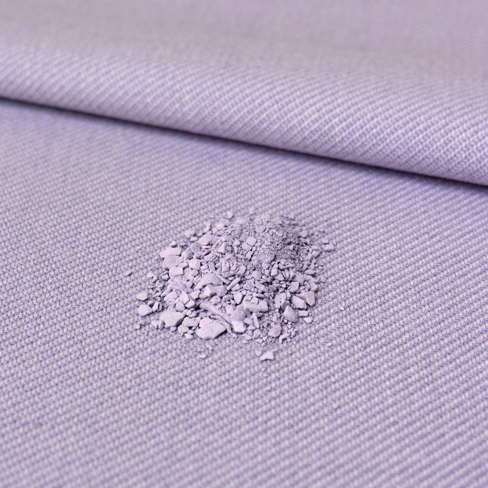
Jonathan Olivares, Twill Weave in Realgar. Photo by Daniele Ansidei.
My Twill Weave collection for Kvadrat developed out of a chain of interests. First came the Thesis House project, which offered the opportunity to create a piece of furniture. Upon diving in, I realized the biggest piece of furniture in Johnson’s original layout was Mies van der Rohe’s daydbed. So I chose to do a day bed. But how and why? For me, the most interesting piece of the house was the columns because, it’s a Miesian house, but Mies built with steel columns, and because of the shortage in World War II, Johnson had to work with wood columns. But the fact that they’re wood was not as interesting to me as the fact that they’re made by mast-makers. So, that’s who I wanted to work with. Except mast makers today don’t use wood. If this had been 20 years ago they might have been using aluminum, but now they use composites, and so we chose to work with carbon fiber. I visited one of the greatest mast makers in New England, where I chose three profiles from a graveyard of mandrels: foil shapes, tapered foil shapes, and circular tube. Using a flexible three-millimeter sheet for the seat, and rigid tubes for the structure, we were able to engineer an object with many performance characteristics that is visually homogenous. The epoxy that binds the cloth is matte-finished, which leaves the cloth’s texture visible and tactile.
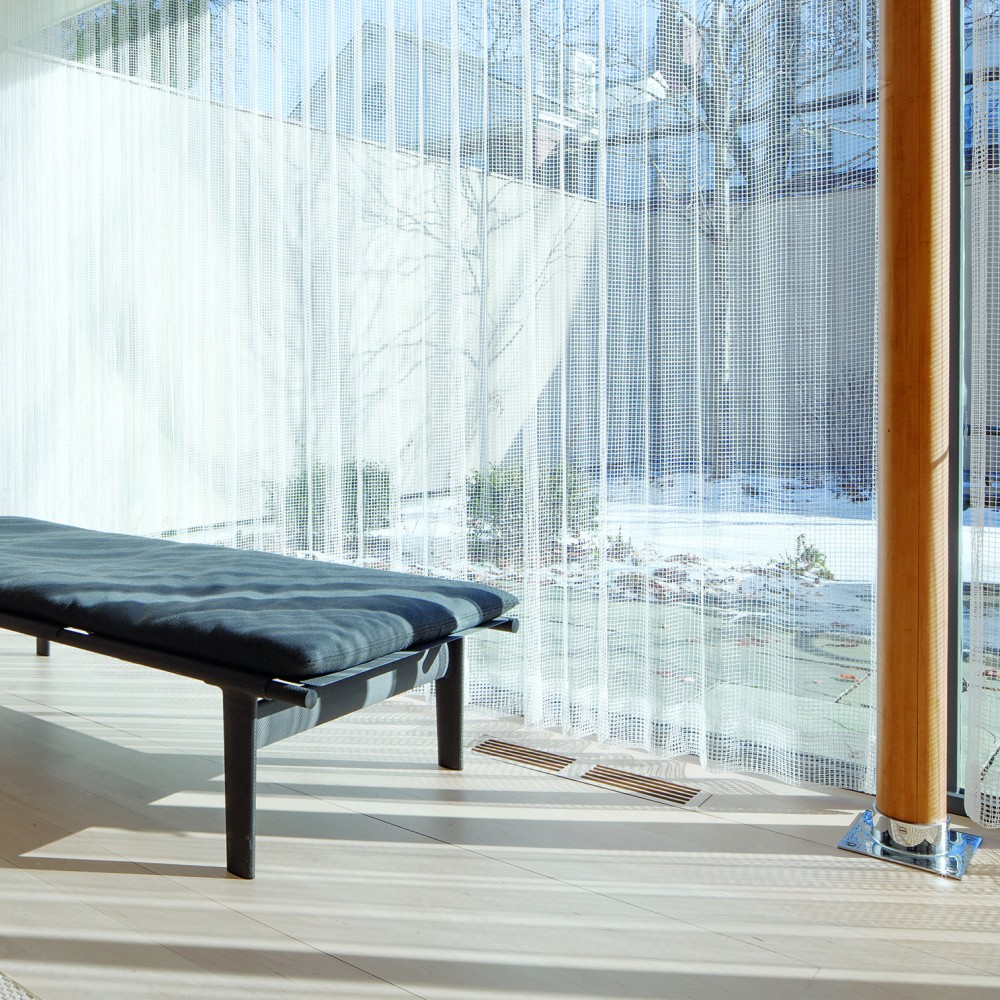
Jonathan Olivares’s Twill Weave Daybed, 2016, photographed at the Philip Johnson Thesis House by Daniele Ansidei.
The difficulty arose when selecting a textile for the cushion that worked with the carbon fiber. I looked at Kvadrat’s options but, I’m not a taste maker, I think in terms of structure, I don’t think ‘that looks nice!’. So I just asked Kvadrat to make a copy of the carbon fiber weave – which was easier said than done. It took me months to realize I needed to define the terminology, Twill Weave, to get the precise weave. Because the wool yarns are about half as wide as the carbon yarns our new textile has the same pattern as carbon fiber, but half as big. It’s a miracle that we got the name, Twill Weave, because it’s the second oldest textile in human history. So, I essentially made a copy of carbon fiber but in wool. Same weave and same color. That means you can make furniture with carbon cloth and our wool textile that results in a total piece of furniture made of twill weave cloth. So, the flexible parts, the rigid parts, and finally the soft cushions, are all one material process, all visually homogeneous.
Jonathan Olivares, Twill Weave
The other side of the project, after we did the graphite colored wool textile, was to launch the textile commercially with 18 colors. I don’t normally think in color, and I knew I couldn’t possibly give them 18 shades of gray. The last thing I want to do is spend my time in a Pantone® book. My philosophy on color has always been threefold. You either take the Richard Meier approach to it, which is you paint it white because white reflects all the colors around it. Or, you take the Richard Sapper approach, which is you make it black, because black hides scratches, dents, and dings; and it prolongs the life of the object. Or, you use the Eamesian approach, which was you use the color of the integral material, as I did with the daybed. But, now I have to do 18 colors. And I don’t want to pick 18 colors. There’s black, white, and, you know, what else?

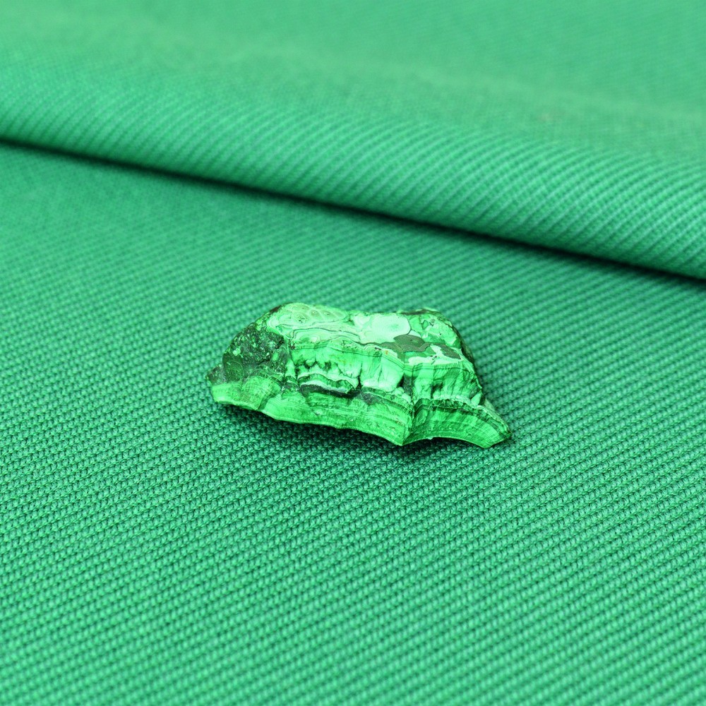
Jonathan Olivares, Twill Weave in Cinnabar. Photo by Daniele Ansidei.
So, I procrastinated for months. At one point I went through my closet and photographed colors that I wear — just to buy time, really. Then the really good trigger was that I was in Stockholm with (London-based Swedish architect) Pernilla Ohrstedt, with whom I’ve worked with for office-related exhibitions for Vitra, and I was looking at all the buildings and I thought, “these colors are fantastic!” I was taking tons of pictures of buildings and asking myself, why are these colors so good?! They somehow made sense with the graphite and all of a sudden Pernilla explains “you know, these are all local minerals, most of Stockholm’s paint industry comes from local minerals.” And that was the breakthrough moment. Of course! Minerals!
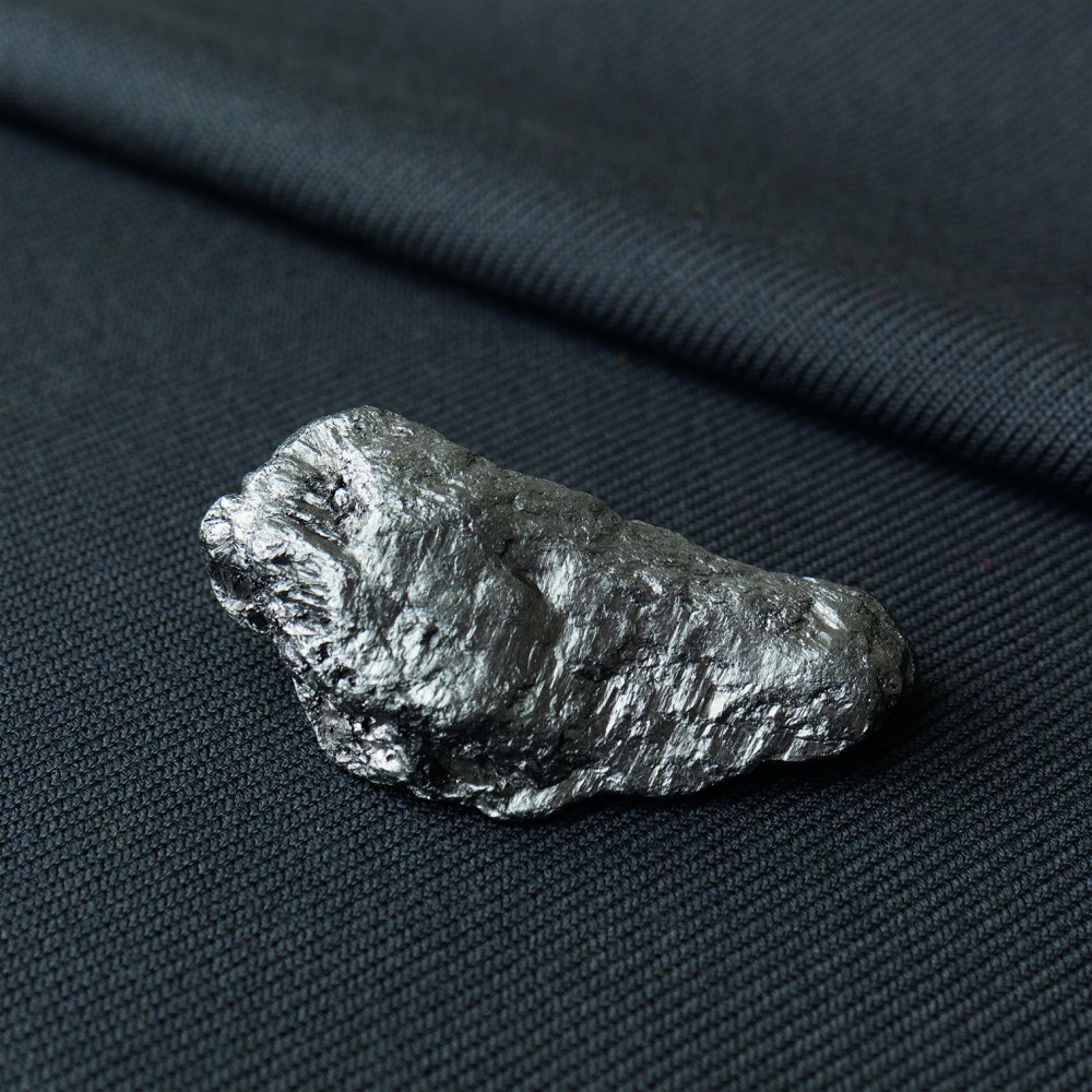
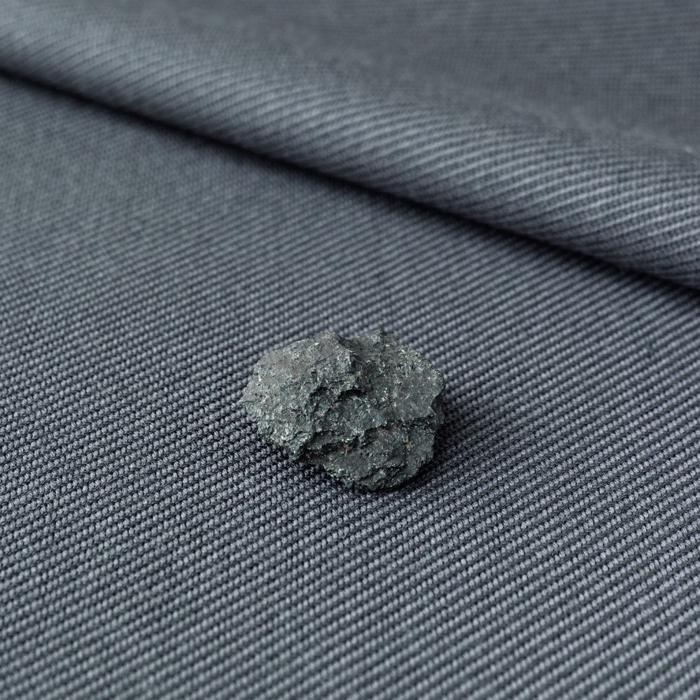
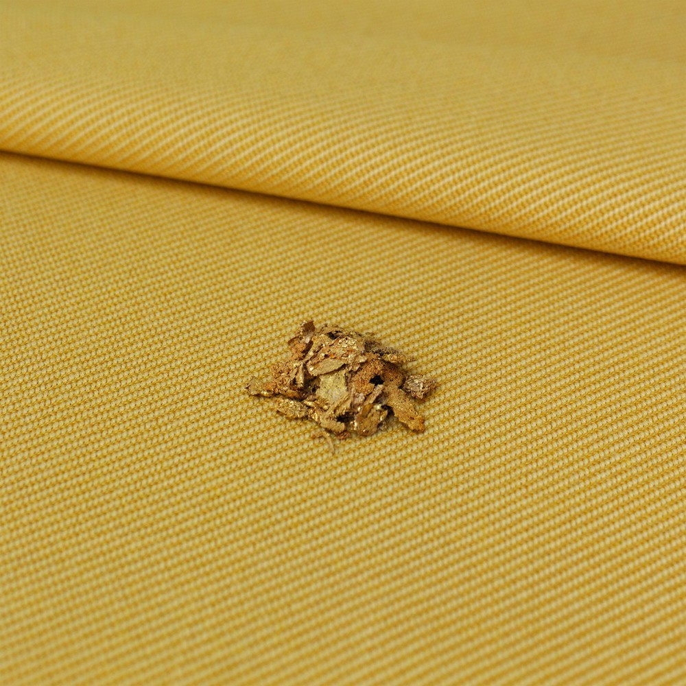
Jonathan Olivares, Twill Weave in Graphite. Photo by Daniele Ansidei.
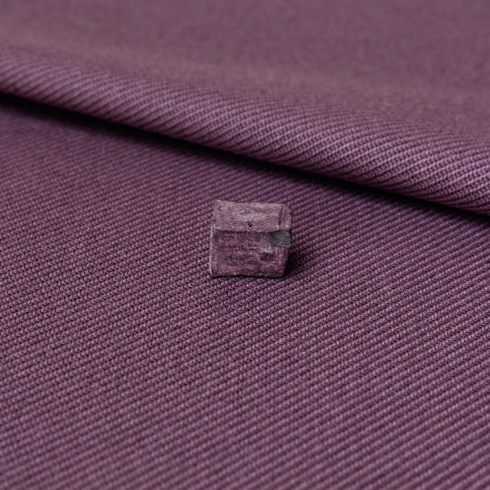
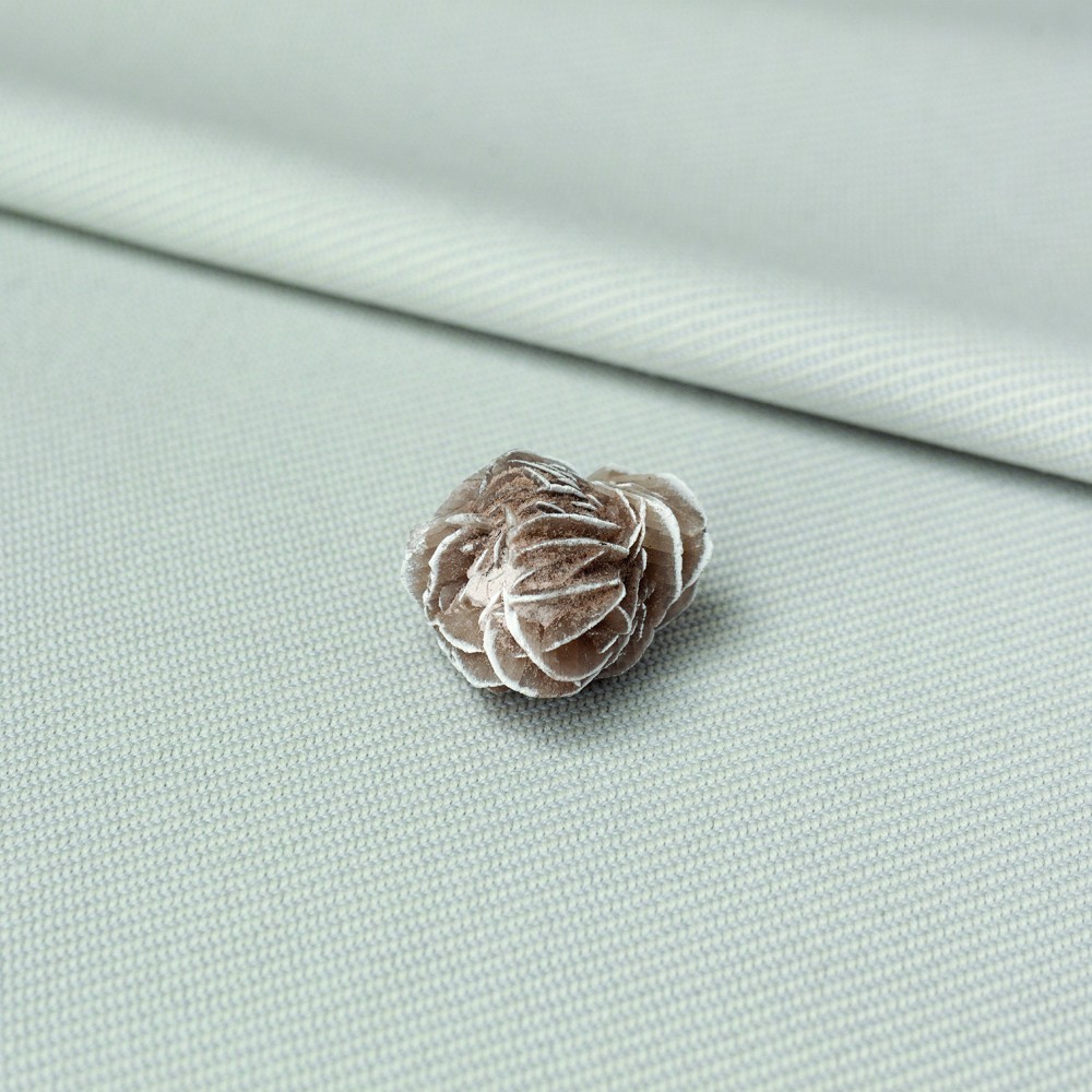
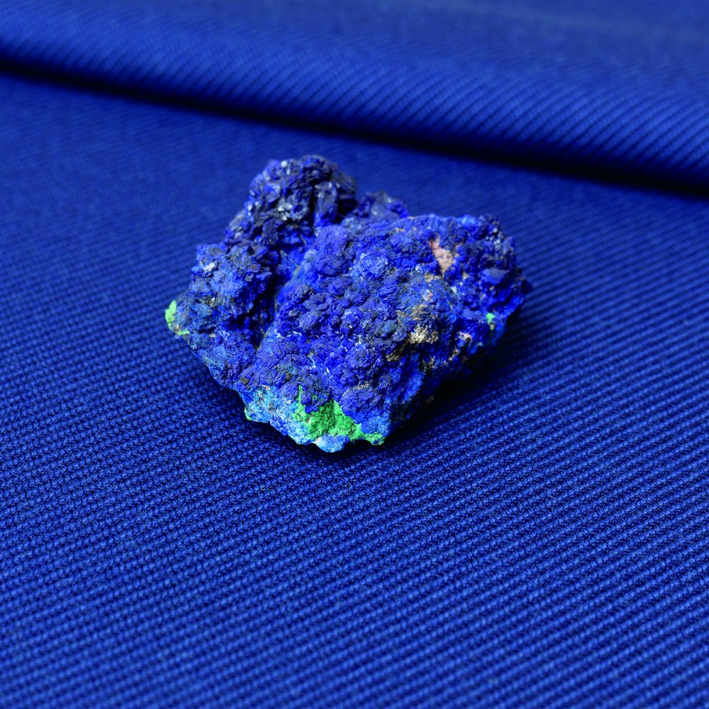
The breakthrough was realizing that I stole the graphite color from carbon, which comes out of the Earth’s crust. So, there’s been no human intervention in the color. Pantone® or RAL provides color products that somebody is selling you. That blue isn’t blue. It’s somebody else’s idea of what blue looks like. This is the kind of color I have wanted to avoid in my practice. In search of unfettered color I contacted Narayan Khandekar, the director of the Straus Center for Conservation and Technical Studies at the Harvard Art Museums. He immediately understood what I was looking for and we began isolating pigments from the Center’s collection that come from minerals and earthen material. So, there’s no manmade color there. I photographed all the pigments and minerals, and I extracted the colors from those photographs.
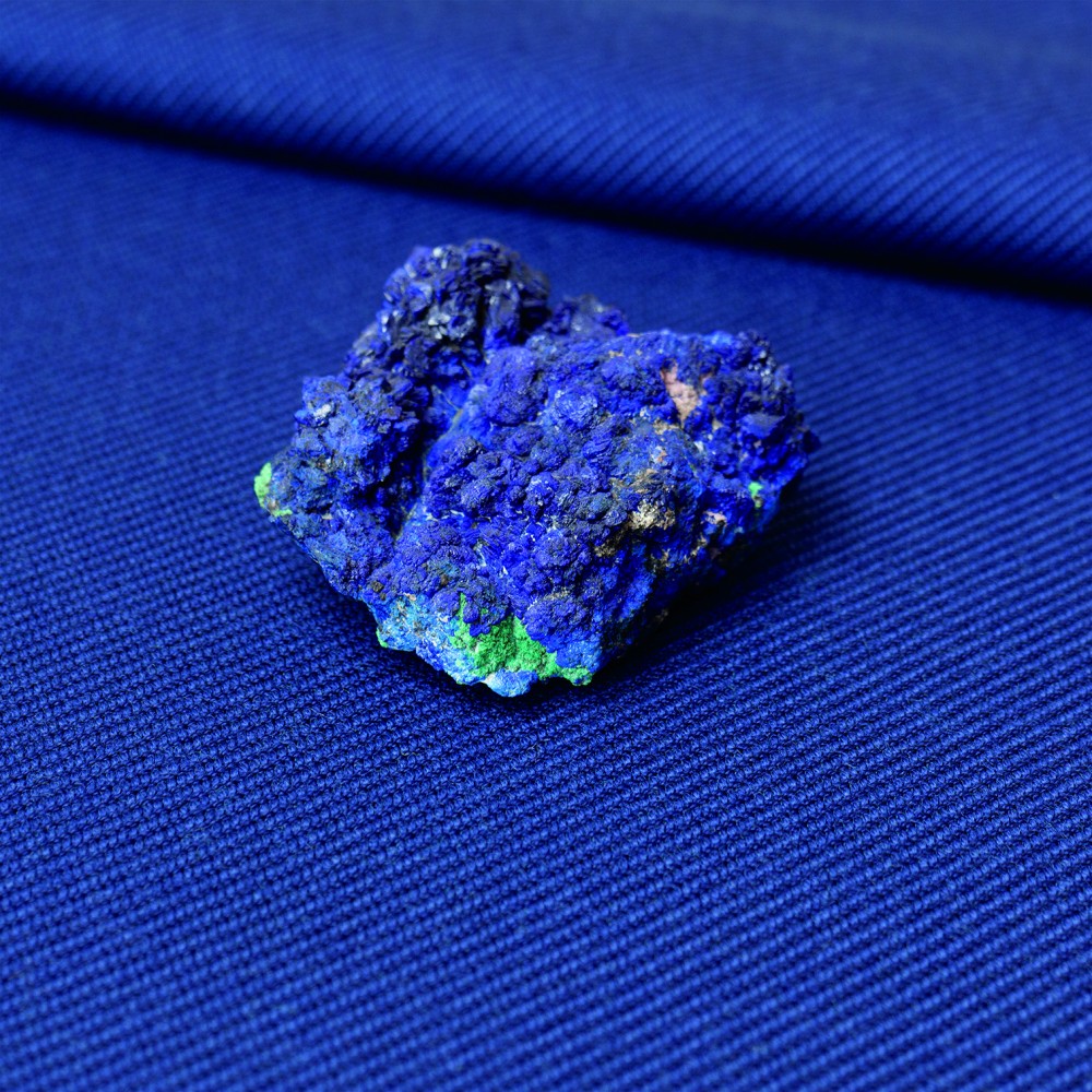
Jonathan Olivares, Twill Weave in Azurite Dark. Photo by Daniele Ansidei.
Narayan and I did a few rounds of color correction, placing the pigments onto prints of the colors I had isolated, until we felt we had matched the colors successfully. He would be like, “I think that blue is too saturated.” Or, “I think this green is too dark.” And so, then we would tweak the digital color sample, reprint it, and then make the comparison again. Once we were satisfied I sent the final color prints to the dye house in Denmark, and they matched the colors to yarns. In the end I can’t really say that I chose these colors, I just set up the parameters that selected the colors. That’s my only connection to them — otherwise they are the true colors that come from the Earth’s crust. In that sense my Twill Weave collection for Kvadrat stands for less human intervention in natural processes and for a closer relationship to the natural world.
As told to Natalia Torija Nieto.
Jonathan Olivares’s Twill Weave collection will be available through Kvadrat worldwide starting May 2018.
All photography by Daniele Ansidei.


