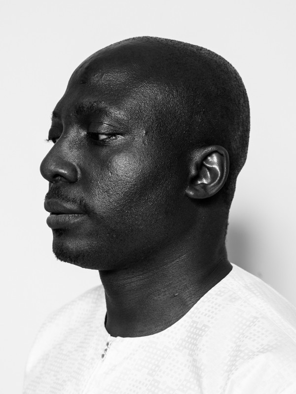
INTERVIEW: Eric N. Mack, the New York Artist Who Paints with Textiles
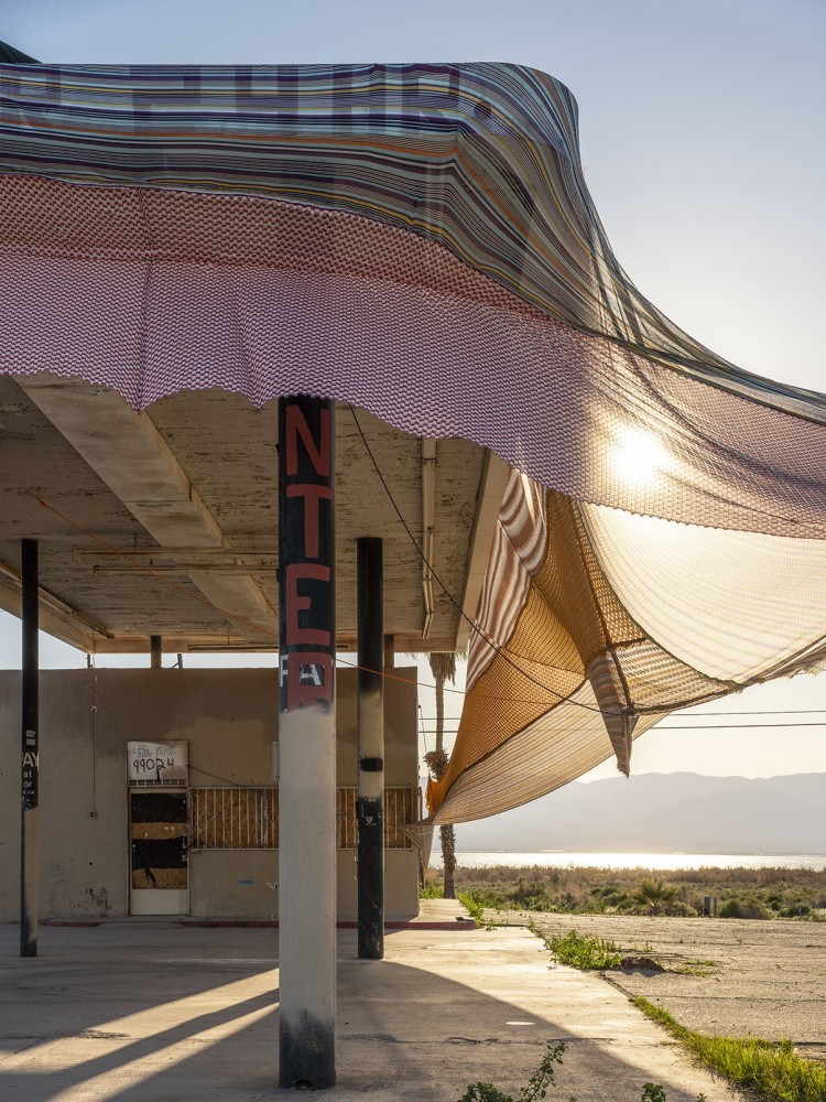
By any standard, artist Eric N. Mack is already having a halcyon year: at the time of writing he has a large-scale work — Halter — that winds its way around the exterior of an abandoned Californian gas station at the Coachella Valley art biennial Desert X, a solo exhibition Lemme walk across the room in the Great Hall at the Brooklyn Museum, and two pieces in the group show A Time for New Dreams at London’s Serpentine Galleries (curated by his friend and past collaborator, fashion designer Grace Wales Bonner). Moreover, the Whitney is featuring the 32-year-old painter in the 2019 edition of its eponymous biennial. Mack’s work forms a private universe where experiments with color, found objects, investigations of memory, and references to Black popular culture, art history, and architecture sit side by side. He challenges everything and somehow makes it all cohere — the moments where dye stains an image of Mary J. Blige torn from a magazine or a moving blanket acts as the ground for a painting are among the instances where he manages to make seemingly disparate things share the same world. First at his studio in New York’s Bronx, and afterwards wandering (characteristically) between Chinatown joints like Dimes and Bacaro, we discussed the recent evolution of his practice, formalism, and Lil’ Kim.
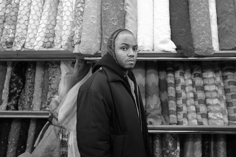
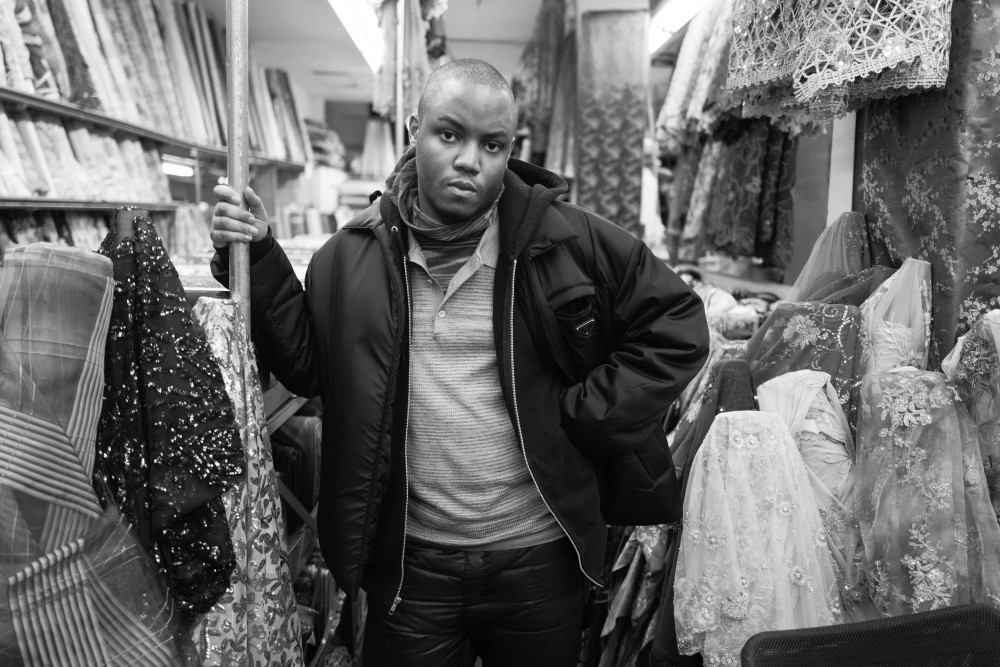
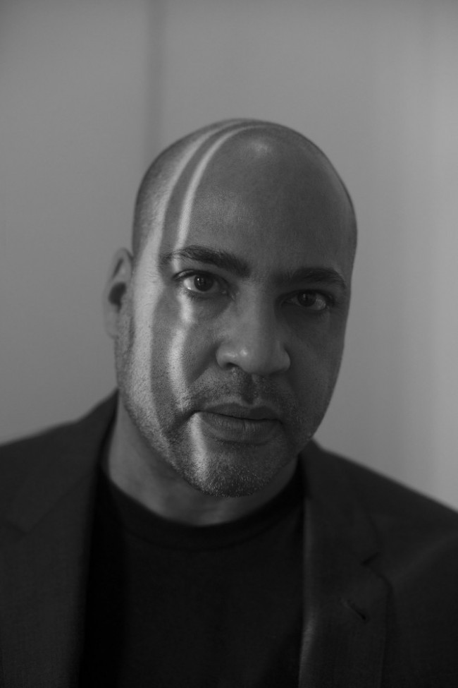
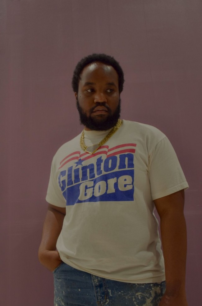
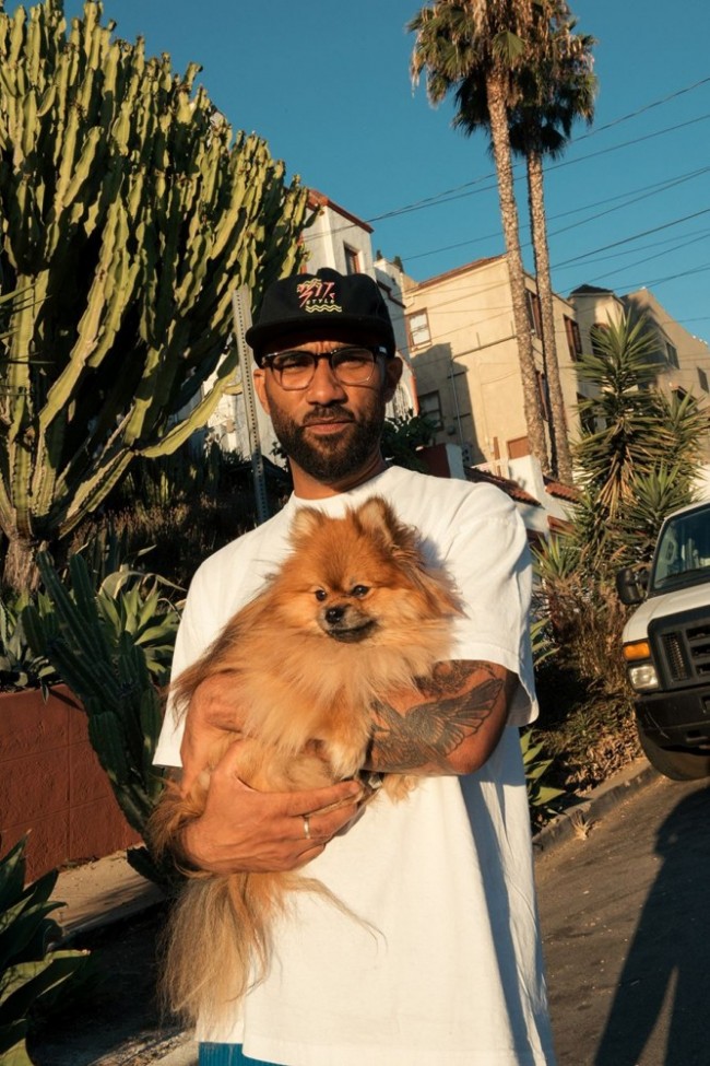
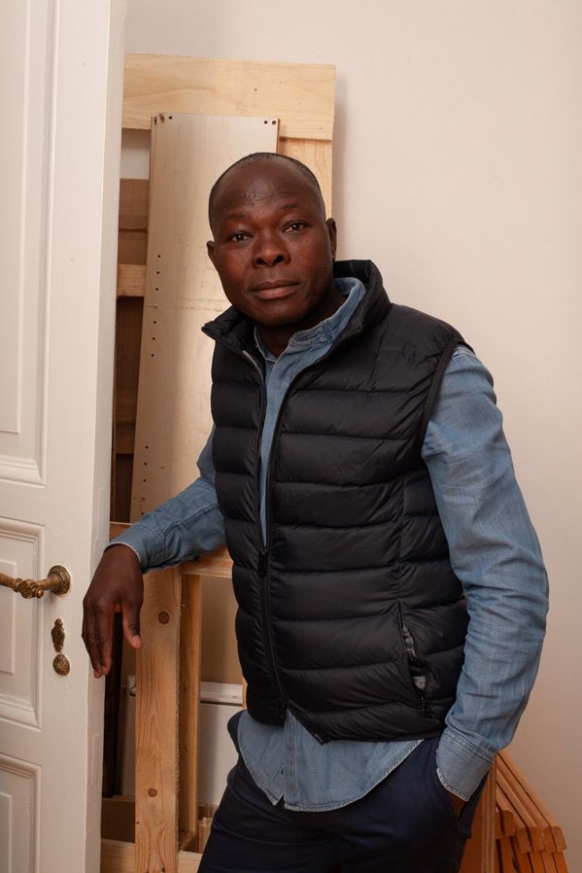
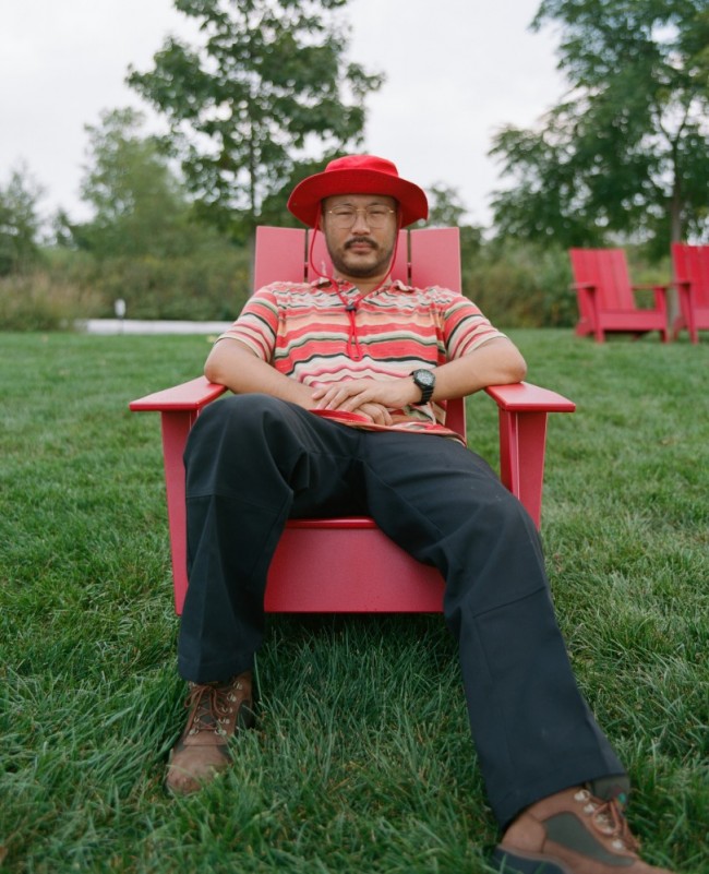
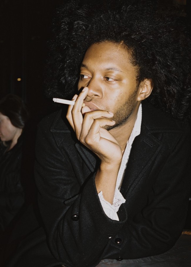
Artist Eric N. Mack photographed for PIN–UP by Rafik Greiss.
It’s worth saying right from the outset that you’re a painter, though your work has taken on increasingly ambitious architectural resonances and has always been in dialogue with other mediums — sculpture, fashion design, set design, printmaking. What does it mean to you to maintain that you are a painter? Is it an ethical statement for you or a methodological one?
I remind myself that painting is at first a fluid medium. It’s been my task to metabolize its fluidity. My work materializes from a series of questions about painting. What it is, but also what it is not. The nuanced sensibilities in surface, use of light, color, texture, but also acknowledging uses beyond aesthetics. I’ve felt it important after its many deaths that painting equip itself with the ability to become more complex as it fuses itself to the everyday. I’m interested in adding to the trajectory of that history. Painting demands a perceptiveness, and there’s also something performative in talking about painting — it feels like a political distinction discussing how the work identifies. The way I’ve learned to paint really has to do with resolving antagonisms I have towards the medium. It’s almost like a system of beliefs.
It’s faith-based in a certain sense.
Absolutely.
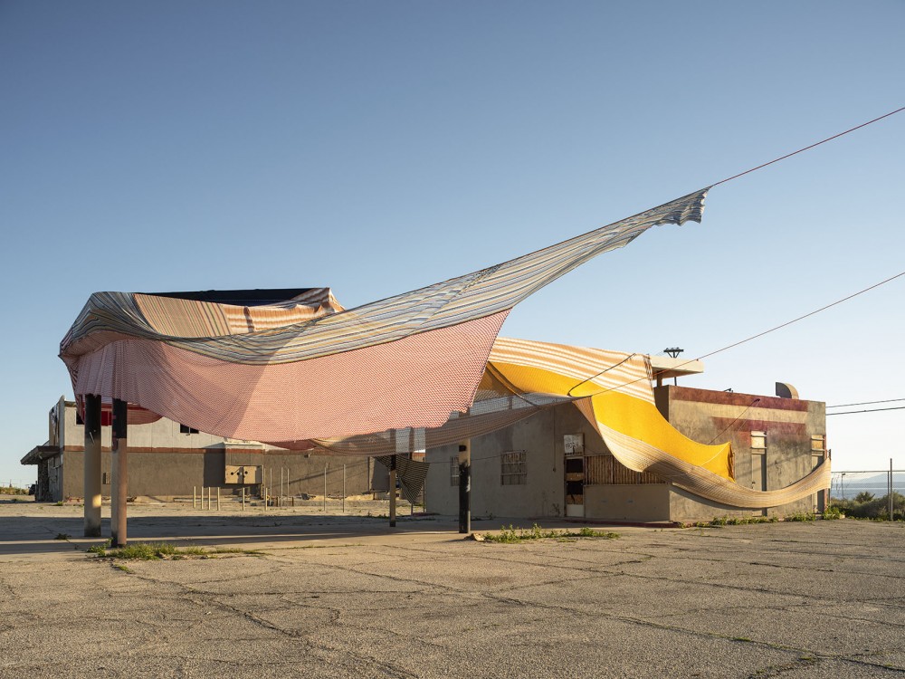
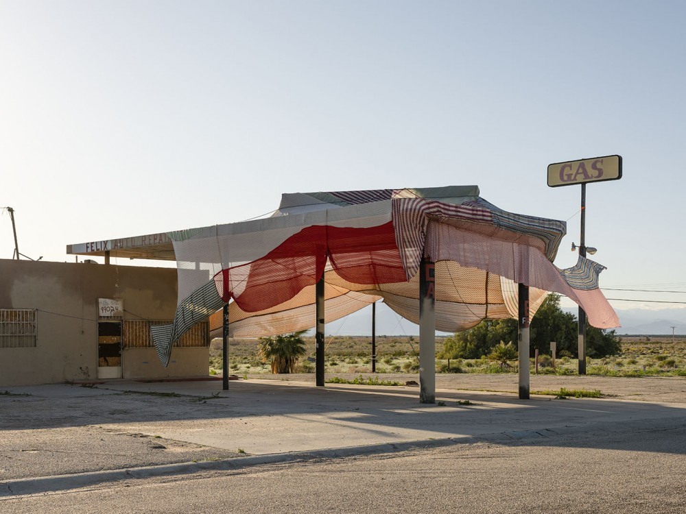
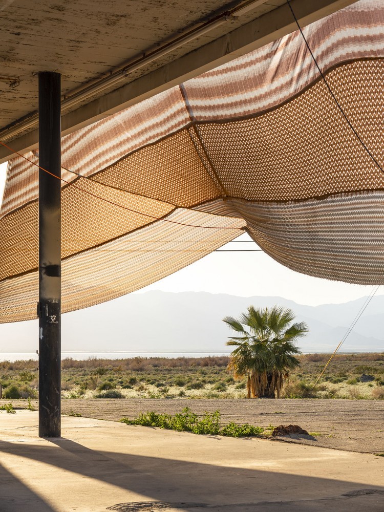
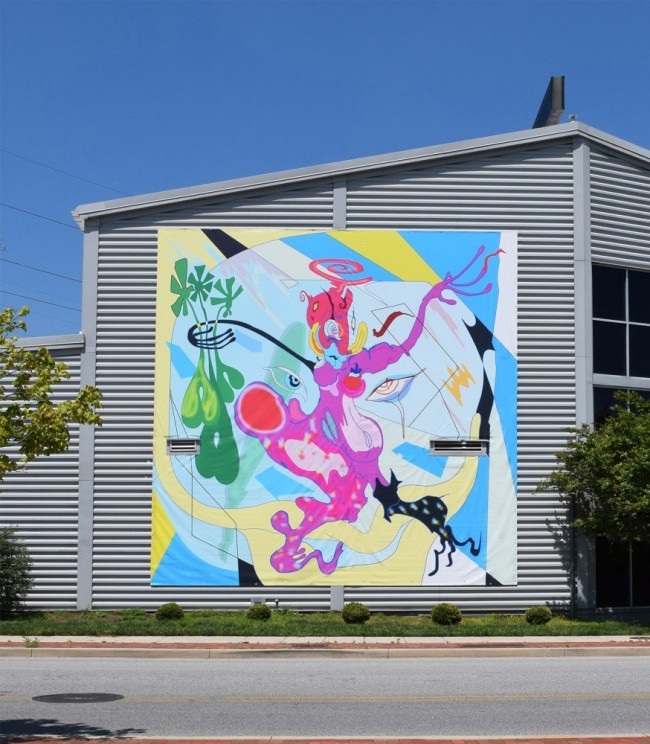
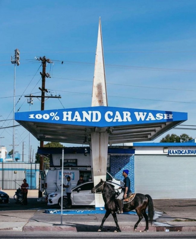
Artist Eric N. Mack's Desert X installation Italic textHalterItalic text (2019) uses the site of a defunct gas station at the edge of the Salton Sea.
It’s been incredible to witness the plasticity of your work in the context of your collaborations with Grace Wales Bonner — fashion shows, performances, and retail installations. How did you and Grace meet?
We met at the opening of Making & Unmaking, a group exhibition curated by Duro Olowu at London’s Camden Arts Centre in 2016. I’d seen her work on Instagram and at her degree show at Central Saint Martins.
What were some of the affinities you shared with Grace? Were you both working on fabric in similar ways, or was it just kind of a shared poetic sensibility?
I think it was a shared poetic. It’s a hard thing to say to a designer that you feel you’re their ideal wearer, that you think their work is made for you. I remember telling her that, and then she told me she could see me in Balenciaga. (Laughs.)
Your most recent collaboration at the Serpentine features two of your works. One of them, A Lesson in Perspective (2017), was previously shown in the U.K. at the BALTIC Centre for Contemporary Art in Gateshead, where it was installed in such a way that it literally consumed the space — it almost dematerialized the architecture, and you had a performer performing in and around the work. At the Serpentine, the context is completely different — the piece is part of a group exhibition and a Wales Bonner runway show. What are your thoughts about your paintings and the various ways they’re sited?
I like the challenge of A Lesson in Perspective being placed in a historical box. Stretching out, bracing the space, but also negotiating its own space between the walls, creating its own kind of traffic. I was able to achieve a degree of constriction with that piece, so it was a game of angles. The cutout in the pieces ends up being this kind of active frame through which you could see the rest of the room. That piece was totally about the invention of perspective, and the orthographic lines end up actually being physical ropes that extend the work out to the periphery.

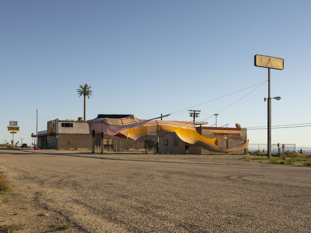
Artist Eric N. Mack's Desert X installation Italic textHalterItalic text (2019) uses the site of a defunct gas station at the edge of the Salton Sea.
Yes, very similar to those Renaissance machines for drawing how, say, Brunelleschi or Dürer would use those sorts of strings to actually produce the parallel lines that disappear into the vanishing point. But you put very different objects in the vanishing point — it’s not a basilica in the distance, it’s a performer’s body or a David Hammons piece.
Exactly. And I’m also thinking about relation and exchange, about communication and distancing points. I think about color in that way too. I think about proximity — the distance between a faint pink color to a saturated magenta. A fiery magenta being very, very frontal versus a beige being so distant as to seem to fade into the walls. I think about intensity, heat, being physical — conditions of light that are painting games materialized in tangible forms.
One of the more fascinating things your work does is to make the viewer aware of the strangeness of museum architecture. Your show in the Great Hall at the Brooklyn Museum certainly does this — it makes you notice the entrance and the exits, the things you can drill into and fasten to, the quality of light and how it affects the colors in the work. Sometimes your work completely reshapes our experience of the space — it’s like you’re in the work and not in the Great Hall anymore.
In one of the pieces in that show, Seat Pleasant (2019), the fabric kind of sits in between pillars in a way that I imagine a newspaper before it’s cut — how it would sit in between the rollers of the press, almost affirming the flatness of the fabric. And the length of the fabric would allow for it to have the flatness of painting in certain places, but also embrace the room in others. I used to think of these works as abstract paintings in which landscape is reduced to a single line, but also where the line acts as a horizon line, the mark of a day, the trace of the body. Then again it can just be decorative or aesthetic.

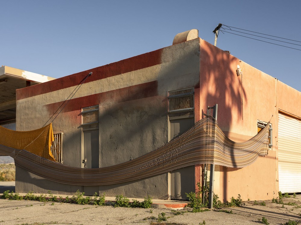
Artist Eric N. Mack's Desert X installation Italic textHalterItalic text (2019) uses the site of a defunct gas station at the edge of the Salton Sea.
What role do objects play in these pieces? I understand the ways in which you’re able to explore line through cording, through long stretches of fabric, through streaks of dye and paint, or gesture, but what about the literal objects that are part of the piece — like the ladder and the fencing in The pedestal is the opposite of the grave (2017)?
Well, the ladder is always potential, a potential use because there’s not much about the sculpture itself that keeps it from being used. But it also ends up being a pedestal that the sculpture is constructed on. And the piece of fencing is all about rupture and flourish and closing the grid, balling the grid up in your hands — creating something decadent and complex and draping the grid on top of it. And then the bed skirt in the piece is made with flounces, and it has a tag from the secondhand shop I bought it from in Florida. And then the cowboy hat, the aluminum pole, the skewers, with the mangled fence... that would just be about styling. About Buffalo style.
So what you’re describing isn’t really assemblage, per se, it’s styling, trying to find a way for seemingly disparate elements to cohere. How do we put these two colors together? How do we match this piece of fence to this other element that’s totally unlike it?
How do we make contradictions that are also harmonies? Unlikely harmonies through contradiction.
Moving from indoors to outdoors, when was the first time you made work outside?
I’ve done summer shows outdoors where the work withstands the rain and dirt at someone’s house or something like that. But I think at the Yale Norfolk School of Art I made most of the work outside. Pouring resin outdoors, and the resin falls off the canvas into the dirt. One of the pieces that I made out there involved dyeing a canvas remnant — I painted on it, bleached it, just did everything to this piece. It looked like Frankenstein’s monster! But I was trying to find the perfect structure for it. And the perfect structure that I found was actually mixing resin and pouring it on one side of it so that the piece would stiffen. It was almost an L-shape. It kind of curled and shifted in form and was stiff. But it was not stiff flat. It ended up being this live shell. The edges remained frayed.
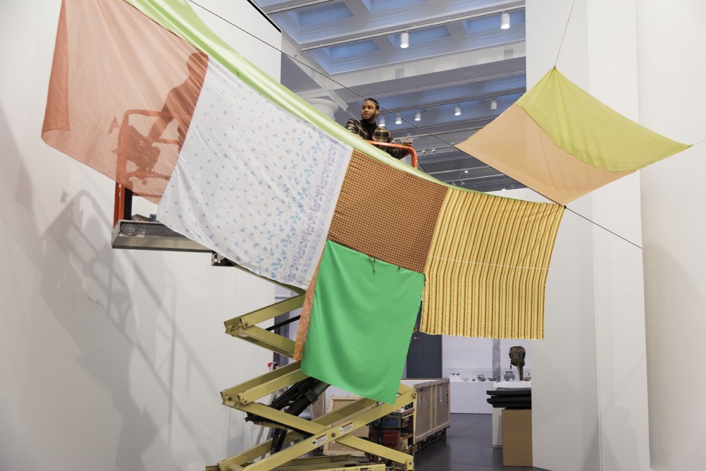
Eric N. Mack installing at the Brooklyn Museum.
You have an incredible piece, Halter, up at Desert X, in which you use vintage Missoni fabrics to wrap an old gas station that sits at the edge of the Salton Sea in Coachella Valley. Working outdoors at such a large scale, how did you think about the work and its relationship to the landscape?
There were different challenges, elemental changes. I will say that I was conscious of dehydration, the wind, etc., the typical things you associate with being in the desert. But the fact is that people live there and have lived there for generations. It’s a cultural space, not an empty landscape; it has its own histories and human traces. We installed not far from Slab City and monuments such as Salvation Mountain. Culture persists even where it’s harder for people to live. The work marks the landscape in a certain way, acknowledges a human presence there, a human mark.
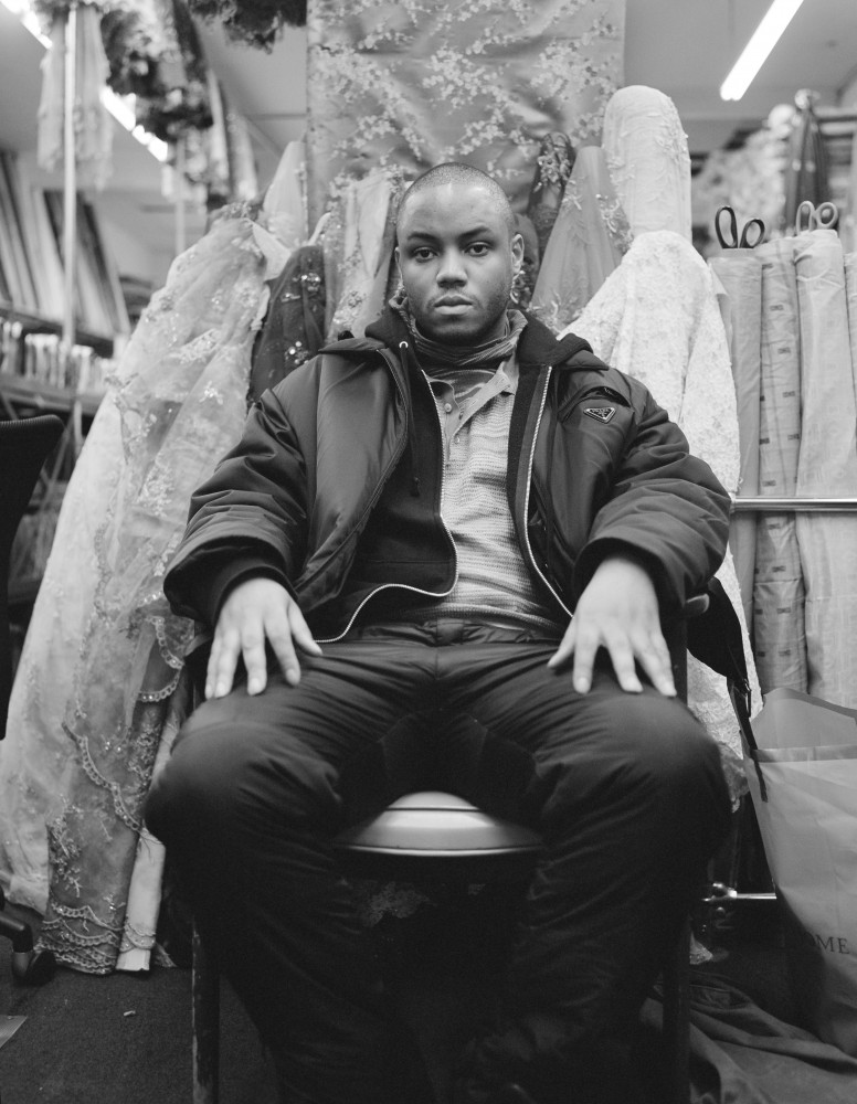
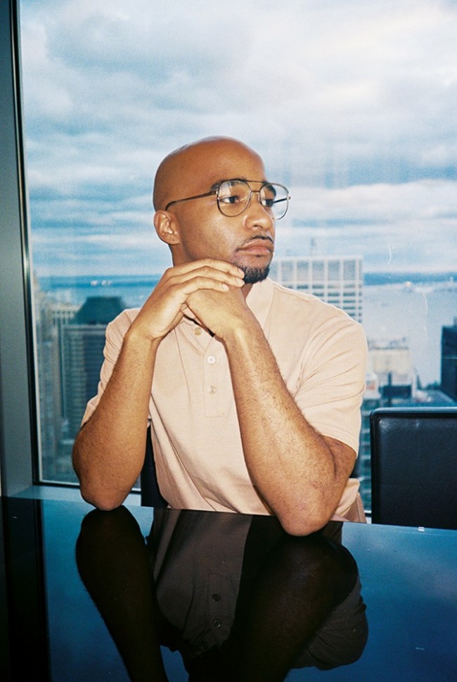
Artist Eric N. Mack photographed for PIN–UP by Rafik Greiss.
Definitely. As opposed to a lot of the discourse around land art that has traditionally been predicated upon erasure, the language around the “virgin earth,” and those aerial photographs of emptied landscapes.
I mean the site was pre-existing. I was thinking about abandonment, gentrification, things awaiting transformation, being primed to be taken over. I was thinking about a biennial that would serve developers and corporations and for that to suddenly serve as a site for artists to intervene, highlight, or acknowledge certain complexities of architectural space, even mundane architectural space. I wondered how a piece like Halter would relate to vernacular architecture, how it uses the language that was there before and brings it into contemporary space through a hybridization.
This makes me think of your show Misa Hylton-Brim (2018) at London’s Simon Lee Gallery and the pieces with the moving blankets, or how you hang carpets or fabrics as walls for warmth. When I first encountered your work at the Studio Museum in Harlem, you were already dealing with issues of shelter — you had enclosures and pieces that one could walk through. It made me think, “What sort of person or thing would occupy this structure?” So much of your work implies a body, whether it’s a question of enclosure or it’s a question of — you could really wear this shit. What role does the body of the viewer play for you in the work?
I guess I’m thinking about a feeling — something sort of like a romantic longing, or a gesture of collectivity, trying to make something that would be felt and empathized with on some base level. Often it has to do with understanding how something feels to the touch by the way it looks. So there’s this eye-hand thing, a visual touch. That’s why the palm ends up being so important to me as a spatial gesture. I constantly think about these spaces and how they impact the viewer — something like being enveloped, being wrapped, being housed. An experience similar to wearing something. Those kinds of slippages are always really interesting to me — the difference between a windbreaker and a nylon Coleman tent. But it’s not just about a specific body, it’s also about a collective body or a larger understanding of what it means to be wrapped or protected, and also to be vulnerable and exposed to some degree.
Sometimes it’s a single, unexpected item that lets you really feel the scale of the work. At the Brooklyn Museum show, for me, it’s the shirt on the hanger, because I look at the shirt and say, “I could fit into that shirt.” I feel in comparison how extremely big and enveloping the rest of the work is, but because there is one particular item that is my size, so to speak, my body is implicated in the piece, right?
Yes, there’s something about the measurement of the hand or the turning radius of the body as in a Rothko that allows it to be truly sublime and monumental. You feel the scale. The artist Byron Kim said he started out making paintings of his arms and that that had been a gesture of early New York School painting — that secretly it was all about the body, about a kind of choreography.

Artist Eric N. Mack's Desert X installation Italic textHalterItalic text (2019) uses the site of a defunct gas station at the edge of the Salton Sea.
Can we talk about Lil’ Kim? She’s such a critical source of inspiration for your work.
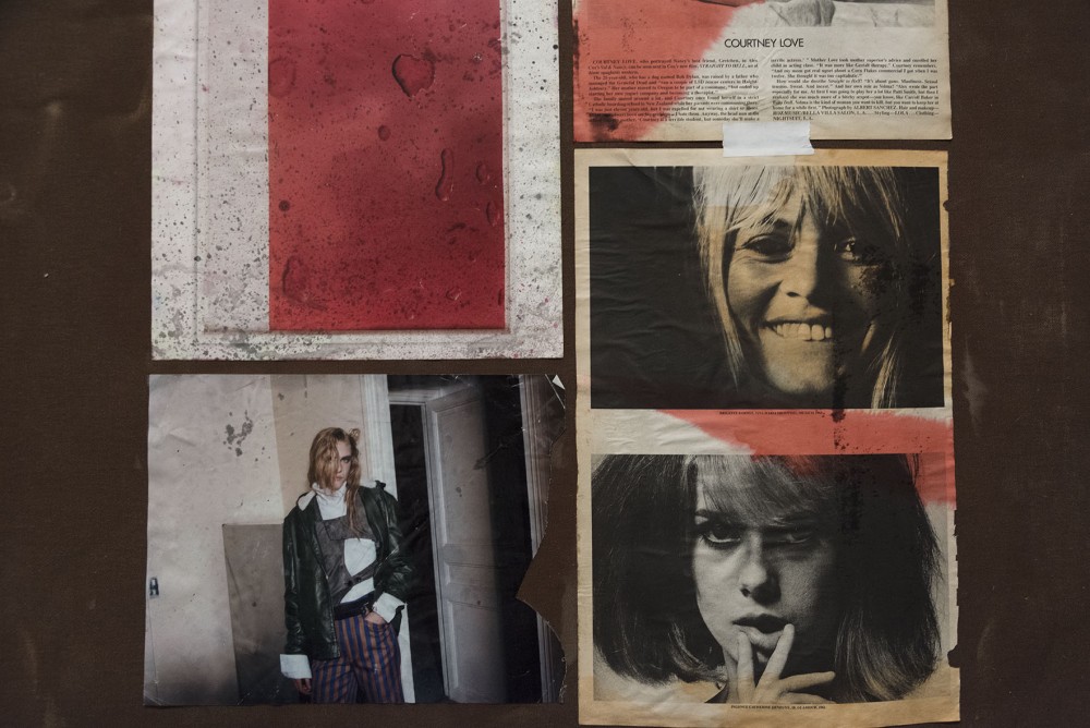
Oh my gosh, I mean, Lil’ Kim for me is the beginning of an archetype of hyper-femme in rap music, but also, she’s a contradiction. I’ve come to see her as a fragile icon over time, but I want to make a distinction between what I thought was fragility and vulnerability. She exemplifies the archetype of the female rapper, she’s an inventor of how we see them. She’s nasty but in the best ways. She’s in control. She’s sex-positive. I remember seeing this Yo! MTV Raps episode she was hosting in front of Bergdorf’s, and when she goes in, you can tell she’s so excited! As if she’d never been on TV before, ever. And she’s talking to Biggie in between reading the teleprompter, and she’s all like, “I know, Big, I’m playin’ myself, but, you know. I’ma go in there and look at some diamonds — all about that bling bling bling, you know?” (Laughs.) It’s just so honest. Her early naïveté was just pure earnestness and she was ready to be a representative of fashion before fashion was able to accept her as a representative of it. On the subject of naïveté, I’m obsessed with something (designer) Andre Walker said during a lecture he gave at the Fashion Institute of Technology. He was talking about growing up, and remembering reading his mom’s W Magazine and seeing a Chloé ad with this beautiful woman in the picture and being like, “Oh, Chloé must be her name,” but then realizing months later that it’s a different woman every time. This is going to be the title of one of my works — I have to use this in some way in the future! “Chloé is just the name of the girl in the photograph.”
To what extent do you return to that time period — the late 90s and early 2000s when you were a teenager — in your work now? Your Simon Lee show was even named after (the stylist) Misa Hylton-Brim, who worked a lot with Lil’ Kim back then.
The thing is, Misa Hylton-Brim was the behind-the-scenes labor who made these looks, and Lil’ Kim was the perfect conduit for them. She says the things that she says, she expresses herself through the clothes — it’s all seamless. I’m also interested in the meaning of these Italian family fashion houses at that time, what they symbolized and then seeing this Black girl from Brooklyn wear these things in such a luxe way. The sequins, the furs. In light of all these recent blackface incidents, like with Gucci and Prada, I’ve been thinking that what it communicates to us, to African-American wearers, is that we weren’t anticipated. That maybe we were never anticipated. You think about Lil’ Kim’s presence when she started wearing Chanel bodysuits and Versace — this was about her embodying the brand and making it her own. But there are racist and classist distinctions that keep these worlds from making contact with one another. It’s taken Tommy Hilfiger so long to realize they need to bring back their 90s clothing to actually be a presence again.
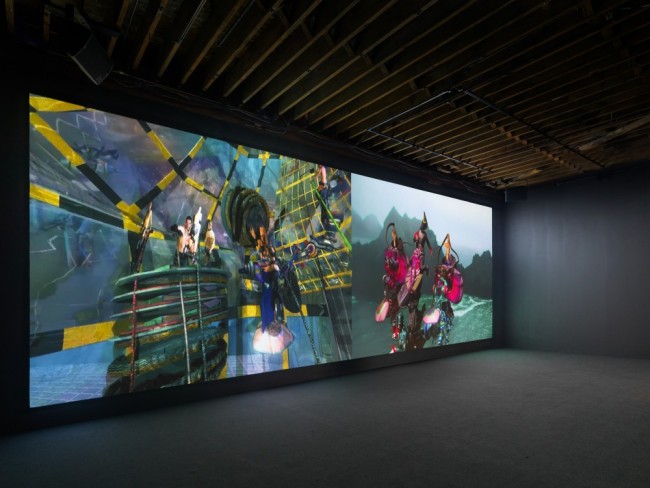
Eric N. Mack: Lemme walk across the room (2019) at the Brooklyn Museum until August 4.
I think some of the surfaces of your work negotiate these kinds of conversations in very nuanced ways. I remember going to the Kunsthalle Basel in 2017 and seeing your installation Parade (2016) with its principal formal gesture of placing an image of Prince at its compositional center. That felt very radical.
That image of Prince for me was an affirmation in a way — the fact that it was a Mapplethorpe photograph, the fact that it was a teenage Prince, negotiated on a tartan plaid, a swatch of fabric. These are the outliers I’m trying to mine.

