MONDO MARI: Favorites From The Late Artist and Designer Enzo Mari’S Oeuvre
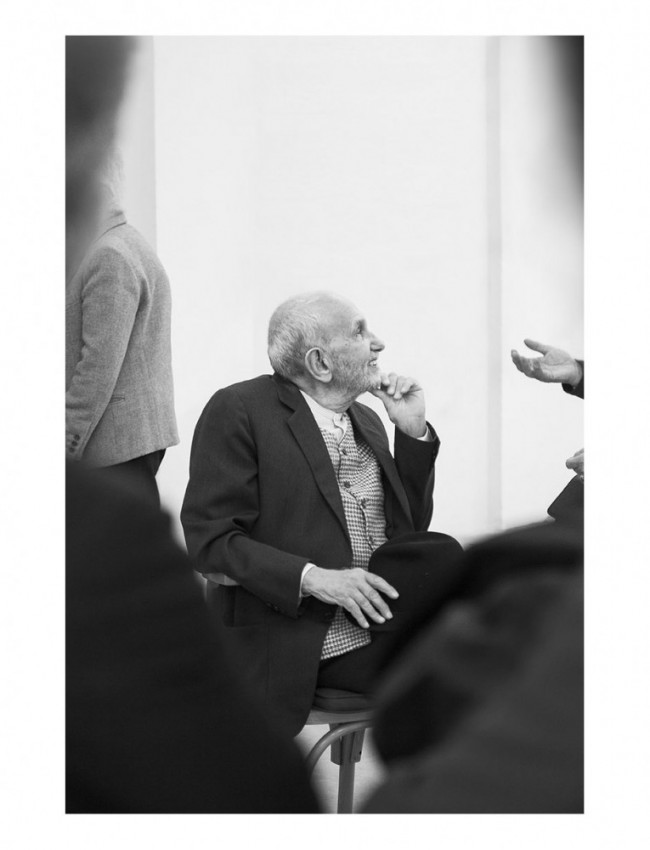
He may not be a household name, but mention Enzo Mari to any respectable living designer and their eyes are certain to light up in reverence. Born in 1932 in Novara, in the north of Italy, the artist and industrial designer spent a lifetime crafting seemingly perfect imperfect objects, from chairs and tables to vases, trays, and children’s toys. He also imbued his oeuvre with a rare sense of both play and — as a life-long committed communist — political urgency and social responsibility. A wide selection of his work has been recently chosen by Hans Ulrich Obrist for the great Enzo Mari retrospective now finally on view at Milan’s Triennale. PIN–UP asked one of the maestro’s greatest admirers, New York-based designer Adam Charlap Hyman, to select a few of his favorites from among Mari’s myriad designs.
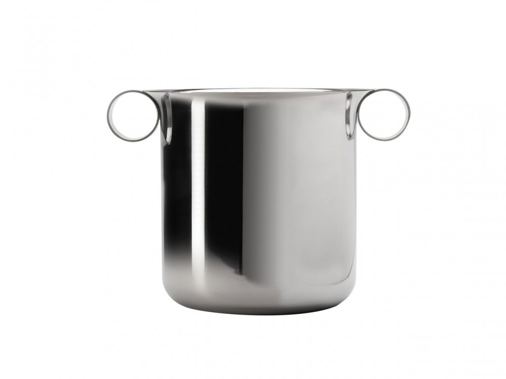
Madera ice bucket for Danese, 1973. “The most elemental shapes come together to make this pure object: exactly all that it needs to be, with no taper, no excess, just geometry.”

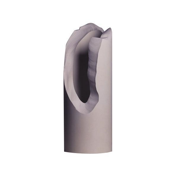
Giglio letter opener for Danese, 1985. “This is a very powerful object, elegant and dangerous. Formally it suggests a cut and curling strip of paper — one is not sure where the blade ends and the handle begins.”
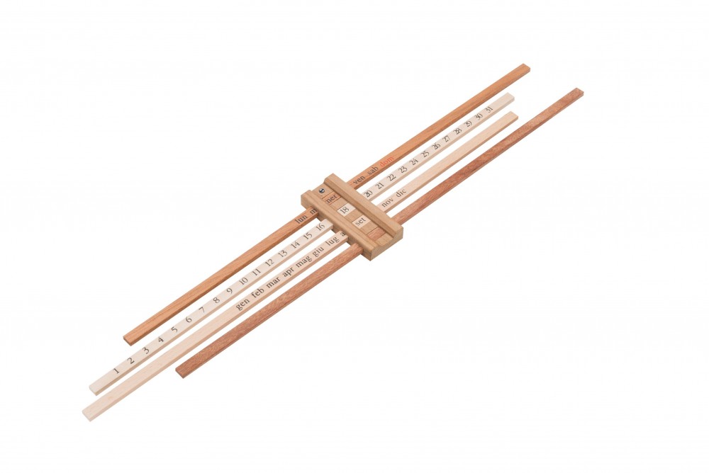
Balencia calendar for Danese, 1959. “To set this calendar, one moves the month and day bands into place and then adjusts the counterweight to maintain a horizontal balance. That this object requires the user to be patient and focused on the simple act of setting the date and balancing all the elements each and every morning is a powerful demonstration of the material world’s agency over time, routine, and daily life.”
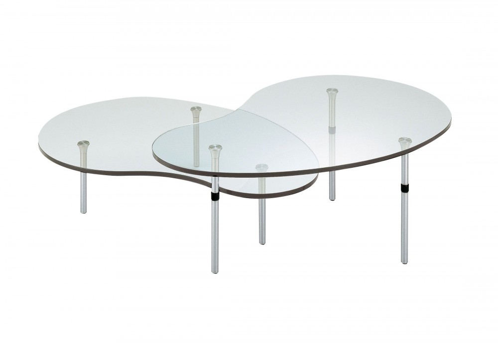
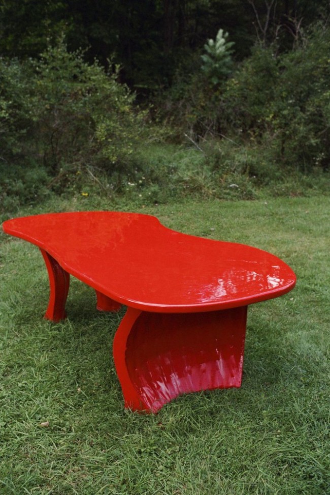
Ambo nesting coffee tables for Zanotta, 1987. “I find these tables very poetic. The legs present the glass as if they were mirages or floating puddles of water. The juncture between the metal legs and the glass is disturbingly — magically — brutal.”
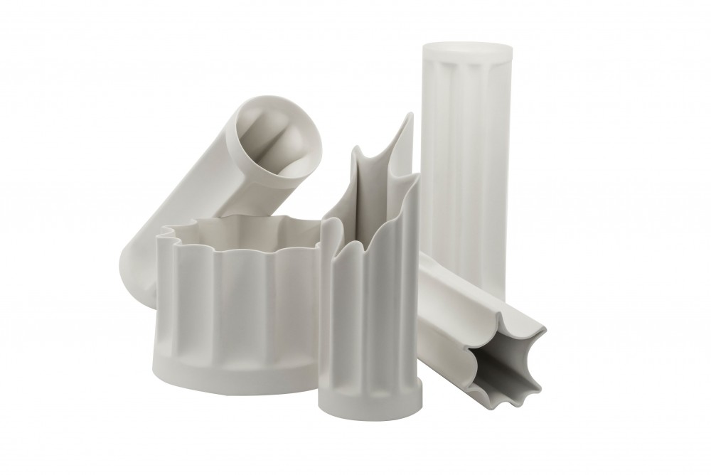
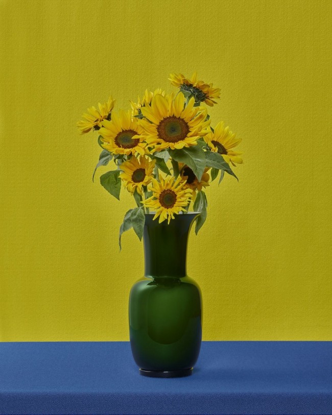
Bambù vases for Danese, 1968–69. “These vases are cast from industrial pipes, though they also look like Classical columns. It is a strange inversion of the idea of containment, since a pipe is meant to transfer water. When filled, they become columns of water — a liquid structure.”
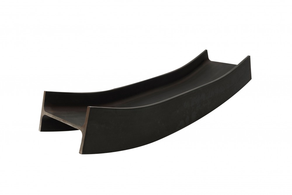
Putrella tray for Danese, 1958. “This object has an almost mystical gravitas. It is a section of I-beam that has been bent. The warpage destroys the beam’s integrity; Mari then removed the heart of the dysfunction, the core of the bend, rendering it useful only for containing spare change or fruit. He takes the ultimate symbol of the progress of our civilization — the I-beam — and destroys it, cuts it apart, and, perversely, recasts it as frivolity.”
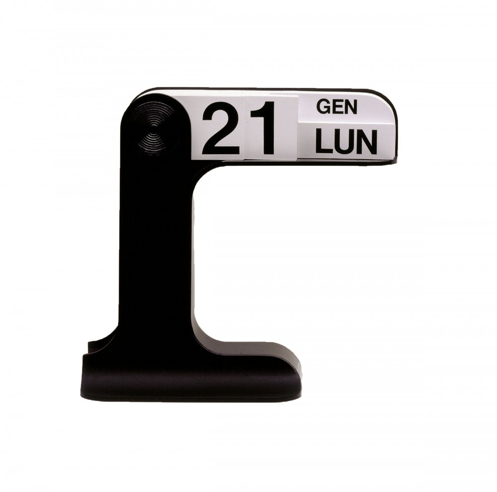
Timor calendar for Danese, 1967. “Another calendar design by Mari that shows the thoroughness of his study into the recording of time’s passage and the way one situates oneself in it. I appreciate the grandness of the gesture required to flip the day’s card into place, at once celebratory and mundane.”
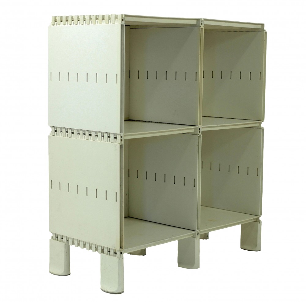
Glifo shelving for Gavina, 1966. “A modular shelving system that plays with the idea of folding and joinery in structure, turning plastic into origami. There is an architectural quality to the pieces when assembled which form a customizable cityscape for display and storage.”
Broken vase for KPM, 1994. “This series of breathtaking porcelain vases finds function in a scar, pulling beauty from violence and creation from destruction.”
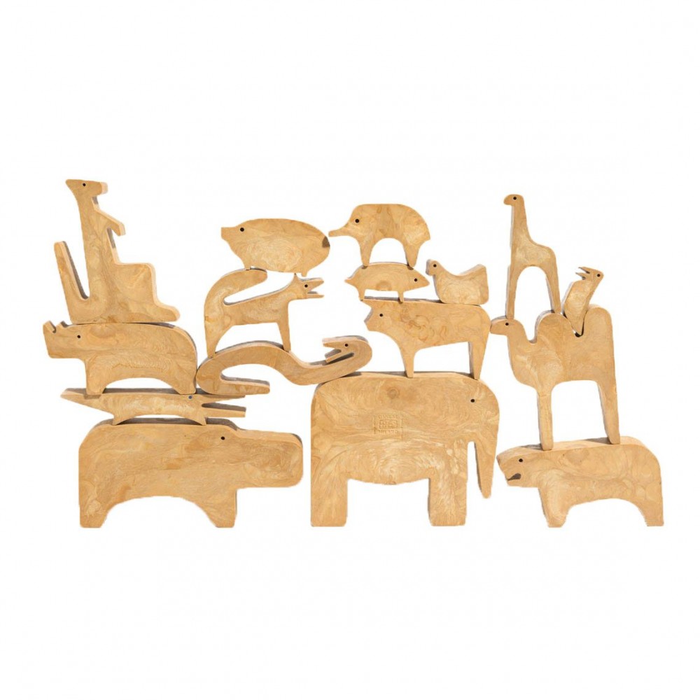
16 Animali puzzle for Danese, 1957–60. “This is an exquisite toy, challenging and beautifully made. It invites you to consider the relationship between light and shadow, form and silhouette. It is wonderful that the constituent parts of the puzzle can have meaning as play things separate from the whole.”
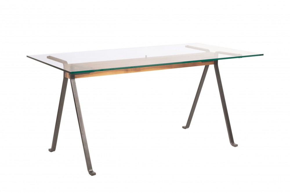
Frate table for Driade, 1973. “The Frate table has an extraordinary delicacy. I love the combination of materials: rough but at the same time refined, strong and fragile. The way the glass top is perched on the thin canted legs makes me think of a winged insect.”
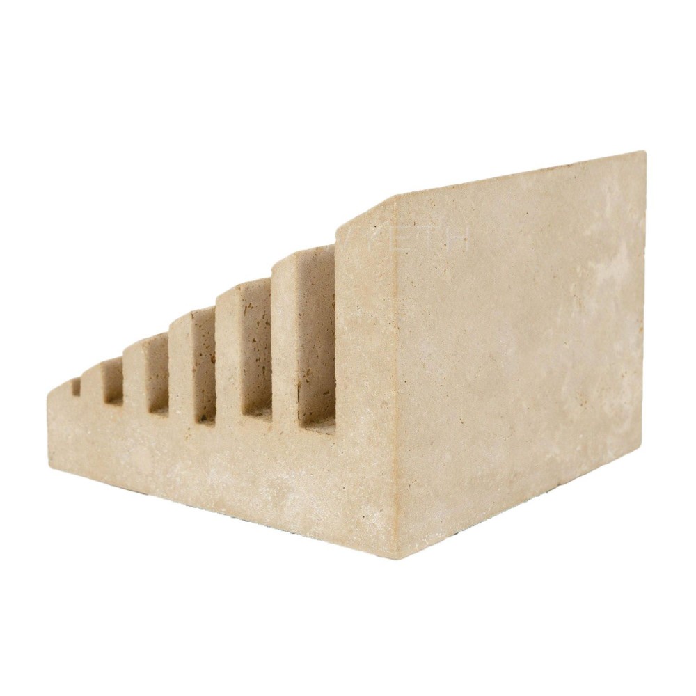
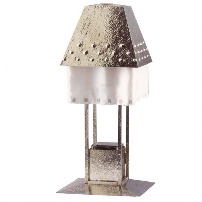
Montecristo paper stand for Danese, 1960. “With this set, the desktop becomes the site of a Classical ruin. The abstract forms made from marble and travertine conjure ancient sites and building materials. Scale is mutable and form speaks to a function that is much larger than the reality.”
Camicia vase for Danese, 1961. “I love the way this vase offers a surprise — the cutout reveals the stem of the flower, magnified by the water and glass like a nature specimen. By isolating the stem — framing it — one can consider its oft-neglected beauty and appreciate the disembodied bloom as an abstraction of a flower.”
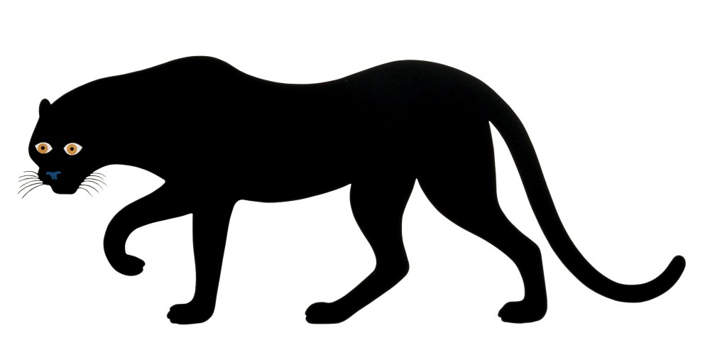
Serie della Natura (La Pantera) print for Danese, 1965. “La Pantera is one of a series of four color silkscreen prints, the Serie della Natura. The animal images are devoid of superfluous detail — they are distilled and essential. With them, Mari was looking at the way we make images into symbols and how symbols become imprinted on the mind.”
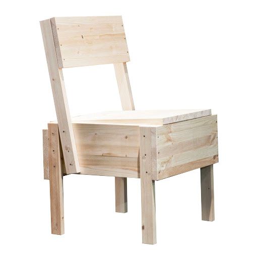
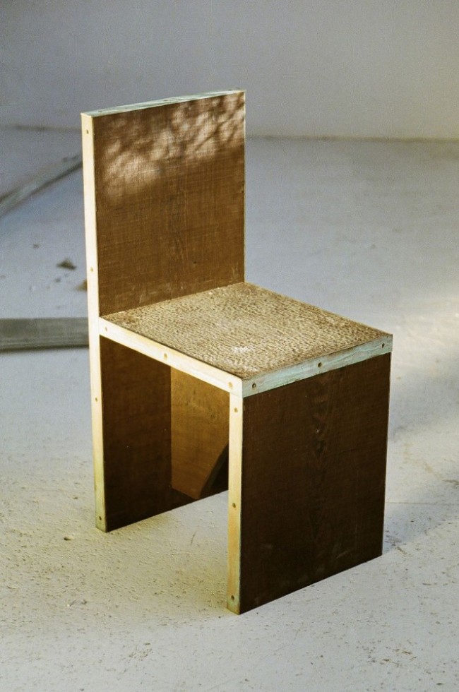
Autoprogettazione series, 1974. “I’m obsessed with Mari’s suite of autoprogettazione, or ‘self-design,’ furniture. The designs were published and distributed so that anyone could build them following the instructions. The collection speaks to the extravagance of structure. It also has an almost metaphysical quality, as though each piece might be a support for a painted backdrop in a theater or an elaborate construction in a Giorgio de Chirico painting.”
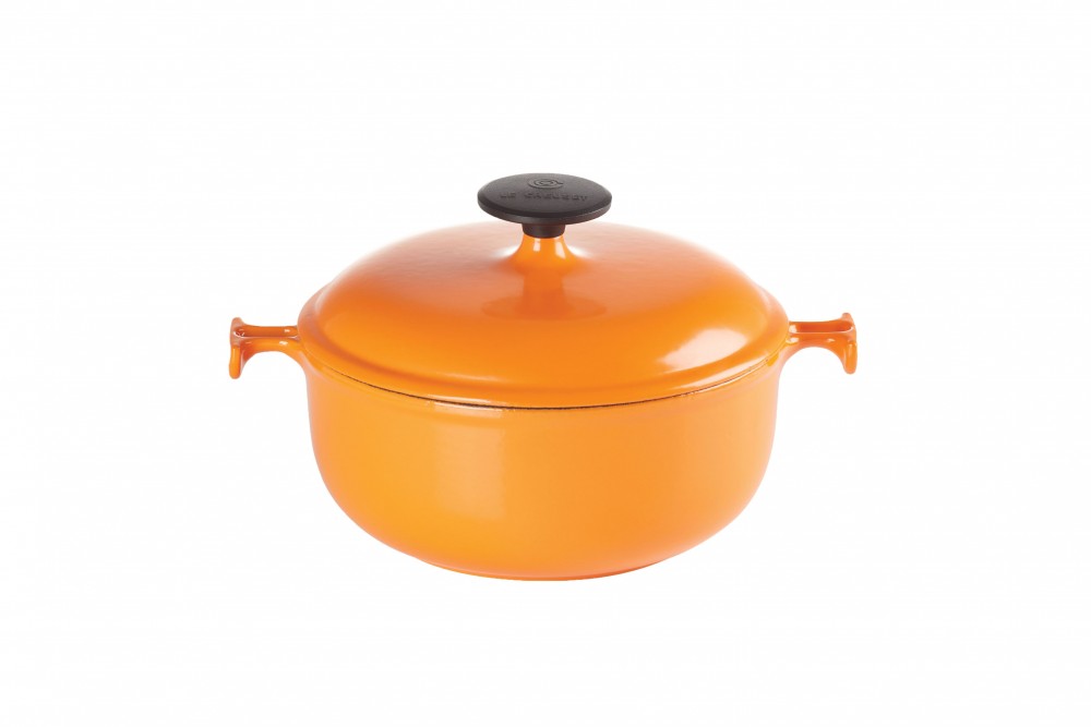
La Mama casserole for Le Creuset, 1972. “I love this design because it shows Mari’s extraordinary ability to rethink even the most essential of objects — the Le Creuset casserole — by adjusting the handles so that they become easier to grip with a cloth or an oven mitt. This humble intervention demonstrates his thoughtfulness and respect for the moments in between the actions we normally think of.”
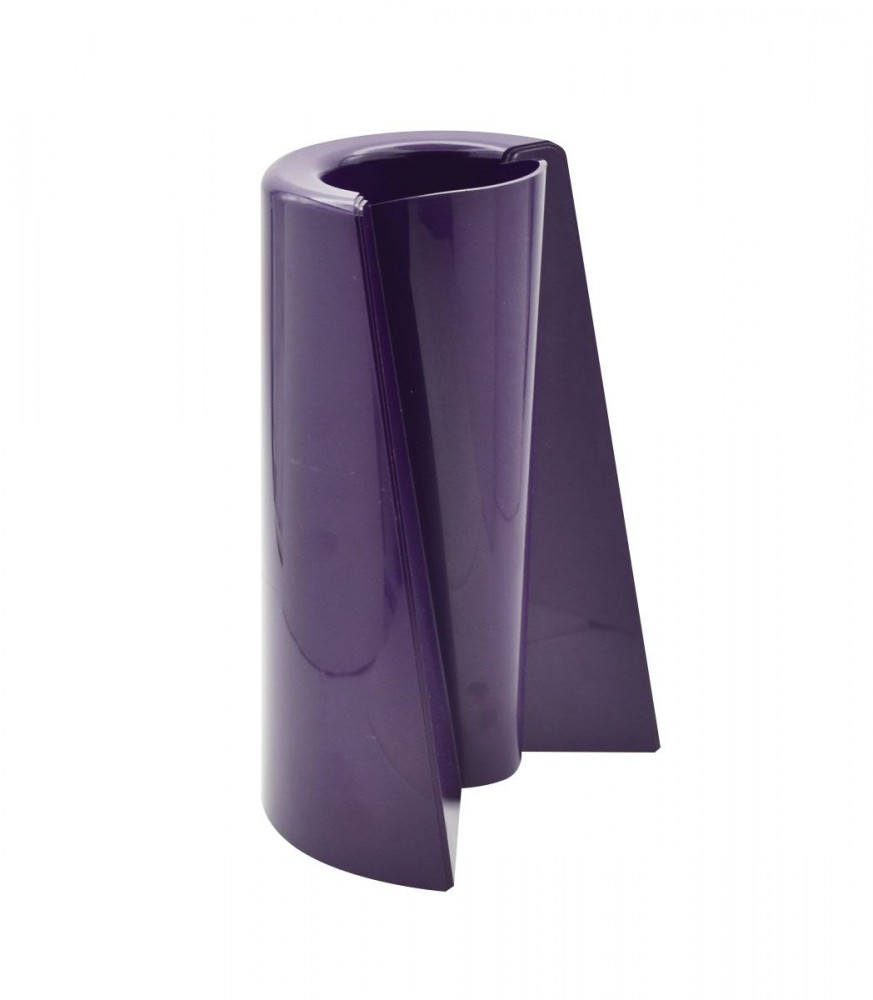
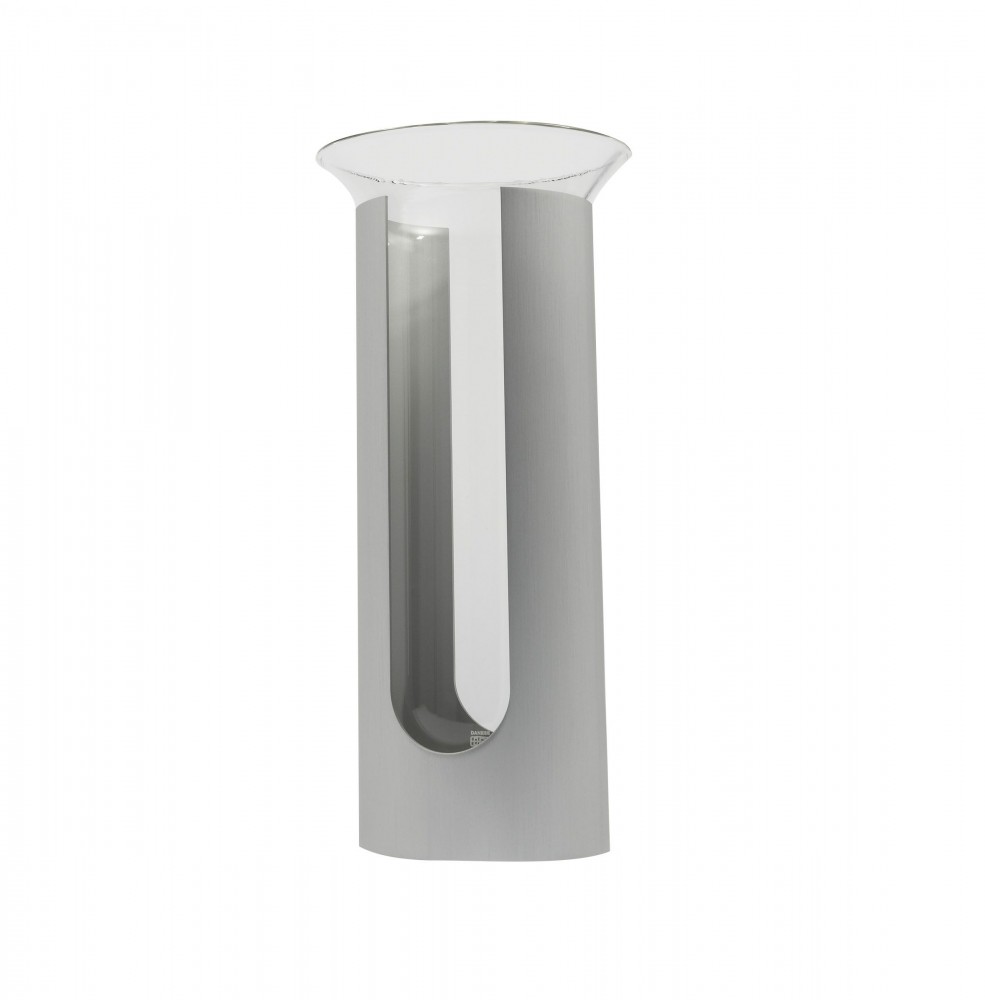
Pago Pago vase for Danese, 1969. “This object is shockingly complex for the simplicity of its function. It is a vase turned either up or down with a wider or narrower neck given one’s flower arrangement. A perfectly Mari gesture of twisting the most essential and even symbolic of forms — the urn — to reveal something hidden, seemingly impossibly, both within and without.”
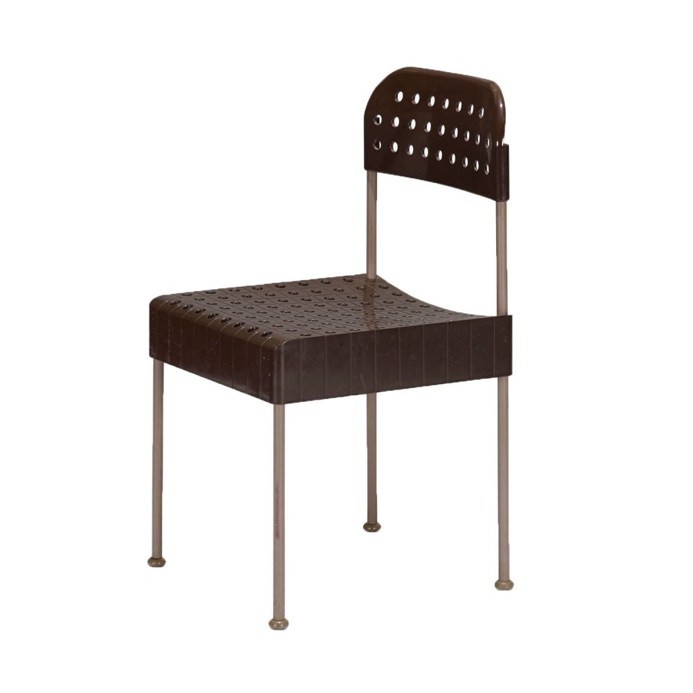
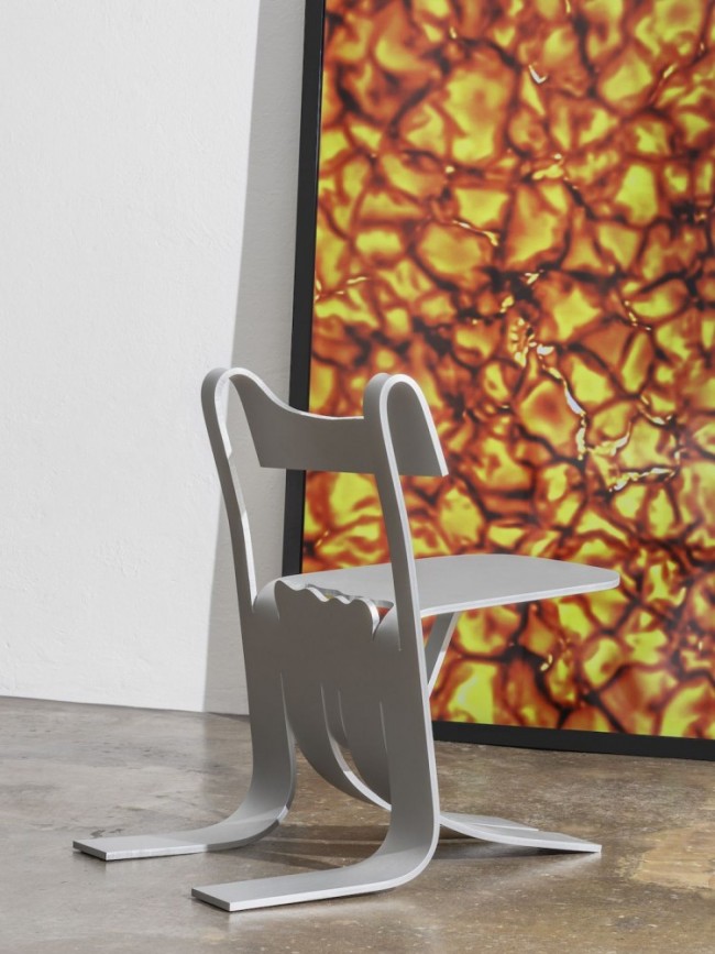
Box chair for Driade, 1971. “The structure of the Box chair speaks to the process of its being fabricated in separate parts and then assembled from a flatpack. There is something quintessentially Mari about the way the chair has a rigorous geometry and a playful materiality. In his world, one material can resemble another: the plastic looks almost like a fabric slipcover stretched over a metal frame.”

Sei Simboli Sinsemantici for Danese, 1972. “This is a series of monochromatic silkscreen prints of six symbols each in their own shade of black ink. The aim of the series was to make an accessible artwork, somewhere between a sign and an abstraction, that challenged the notion of original thought and collective understanding.”
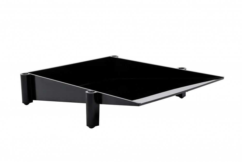
Sumatra correspondence tray for Danese, 1976. “The tray’s stackability transforms the desk into a landscape of supplies and papers. Mari was playing with the tension between a material and its formal implications — the plastic becomes impossibly sharp and heavy-looking.”
Selection by Adam Charlap Hyman.
Video animation by Marina Menéndez-Pidal.
Creative direction by Felix Burrichter.
Enzo Mari curated by Hans Ulrich Obrist with Francesca Giacomelliis on view at the Triennale die Milano in Milan, Italy, from October 17, 2020, until April 21, 2021.
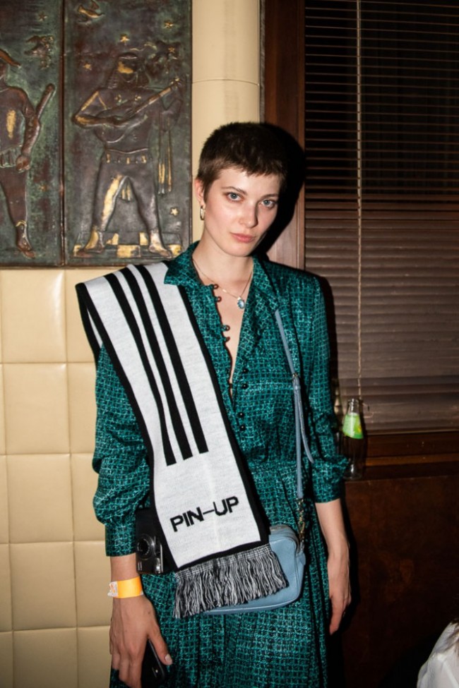
Taken from PIN–UP 28, Spring Summer 2020.