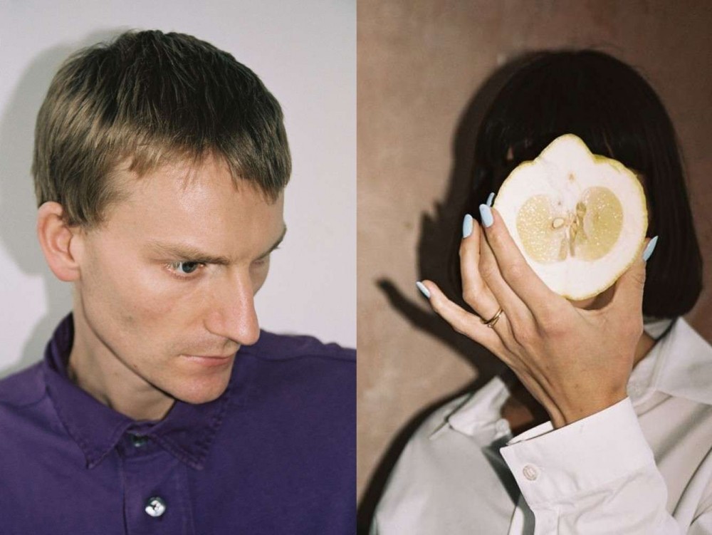
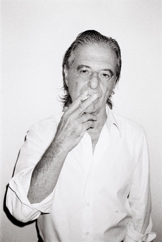
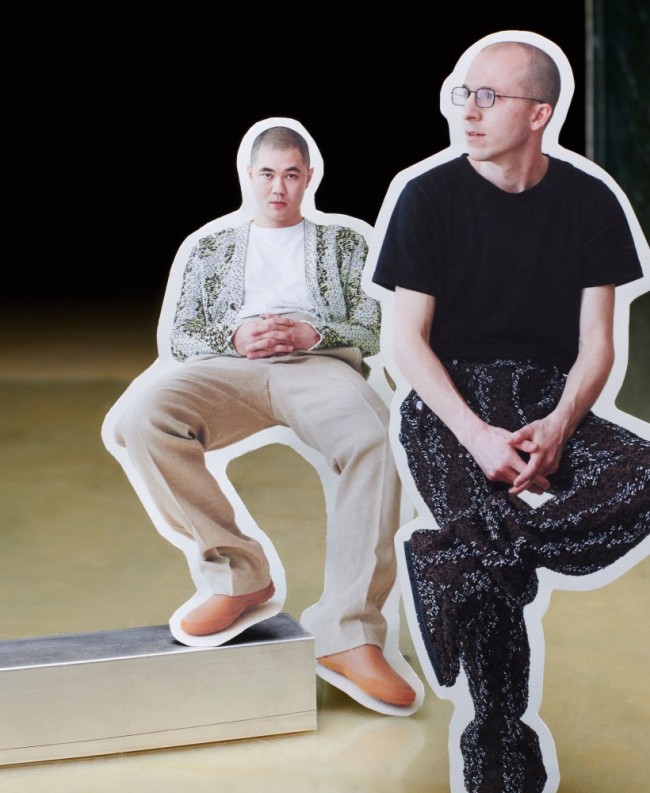
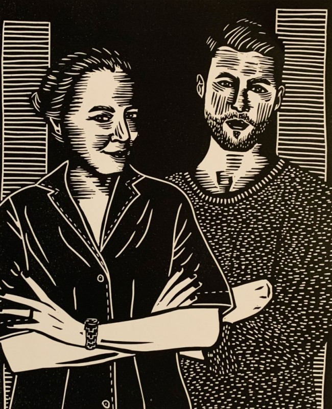
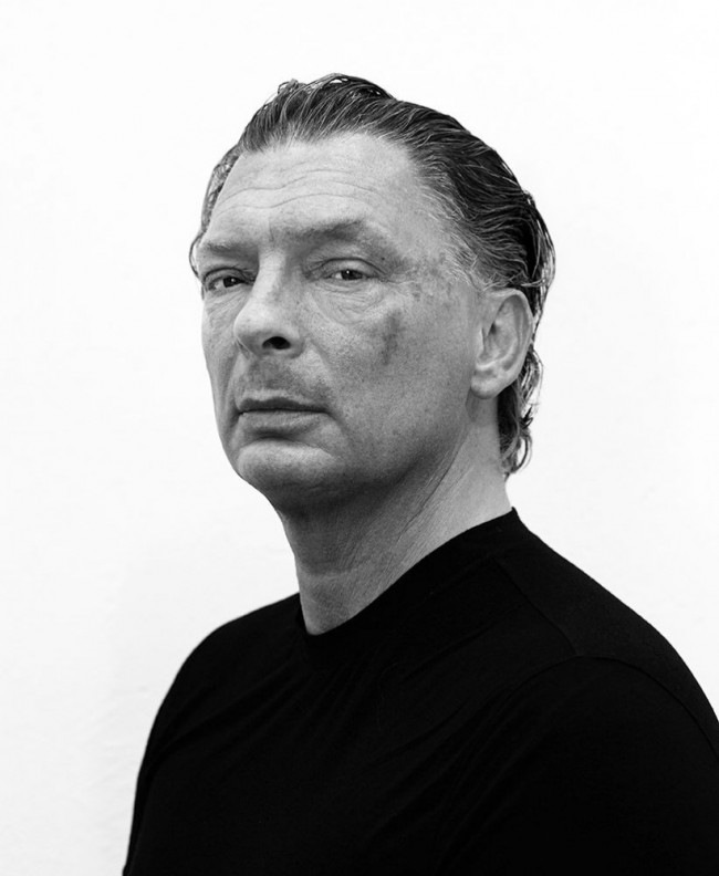
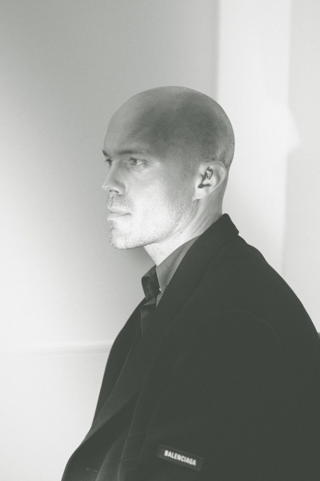
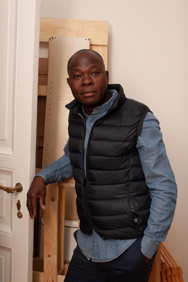
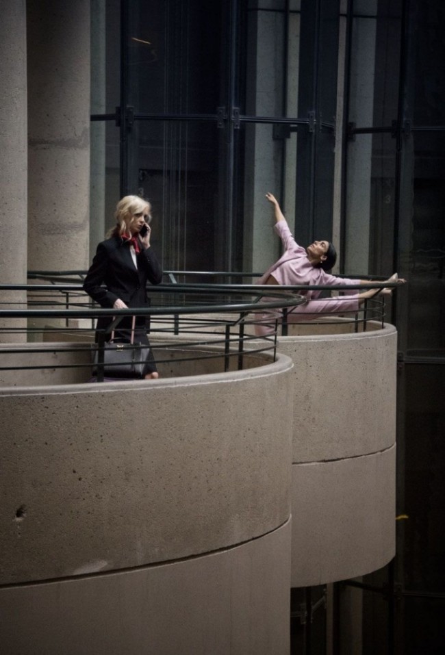
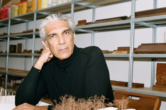
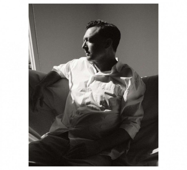
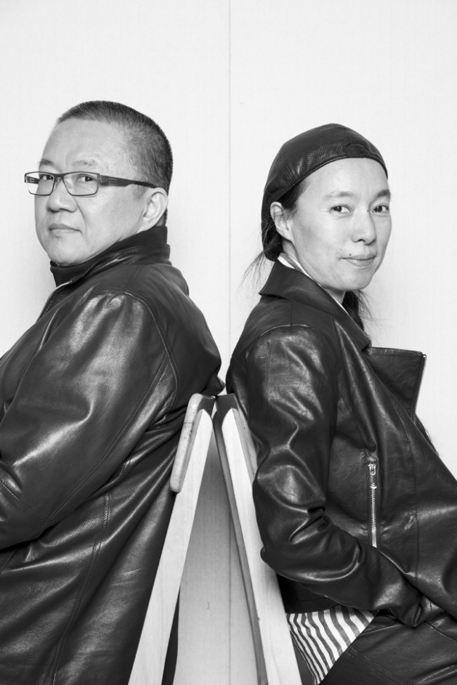
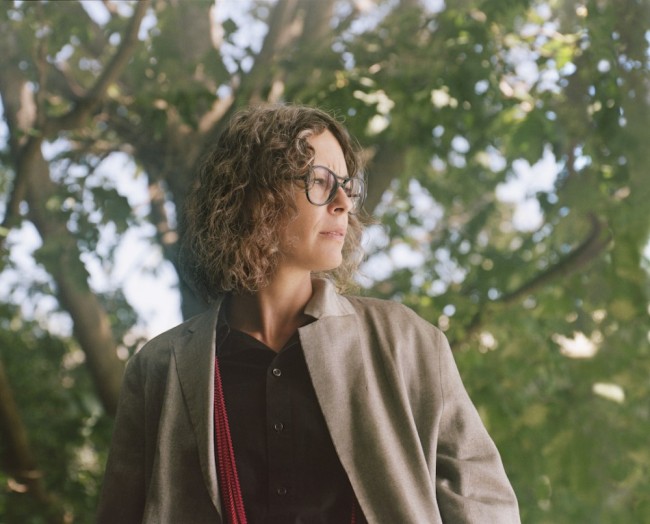
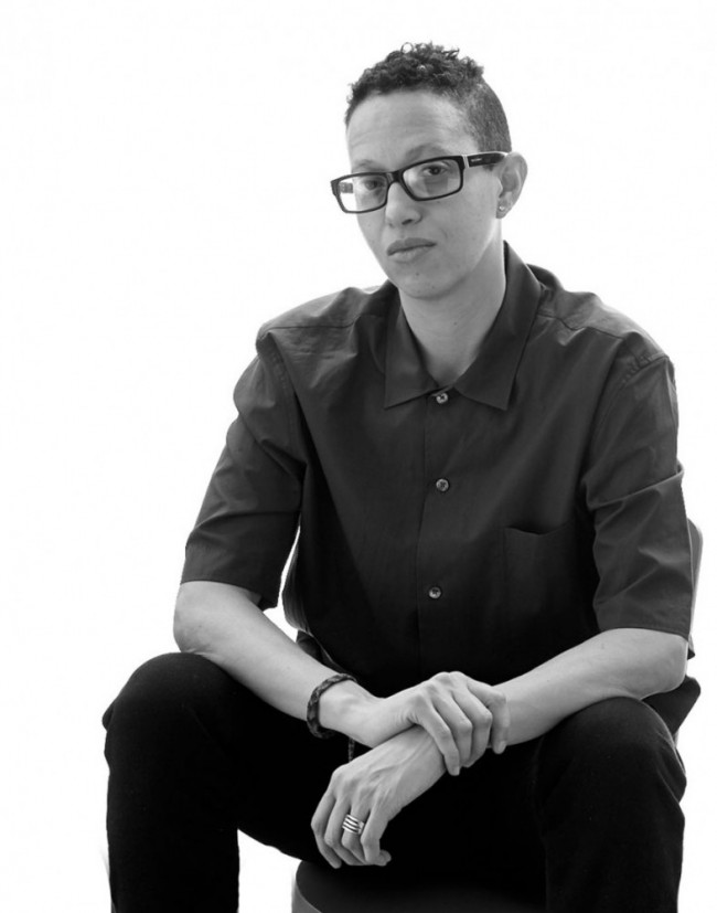
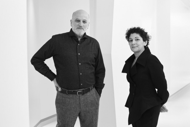
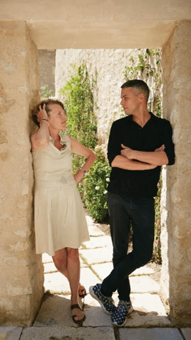
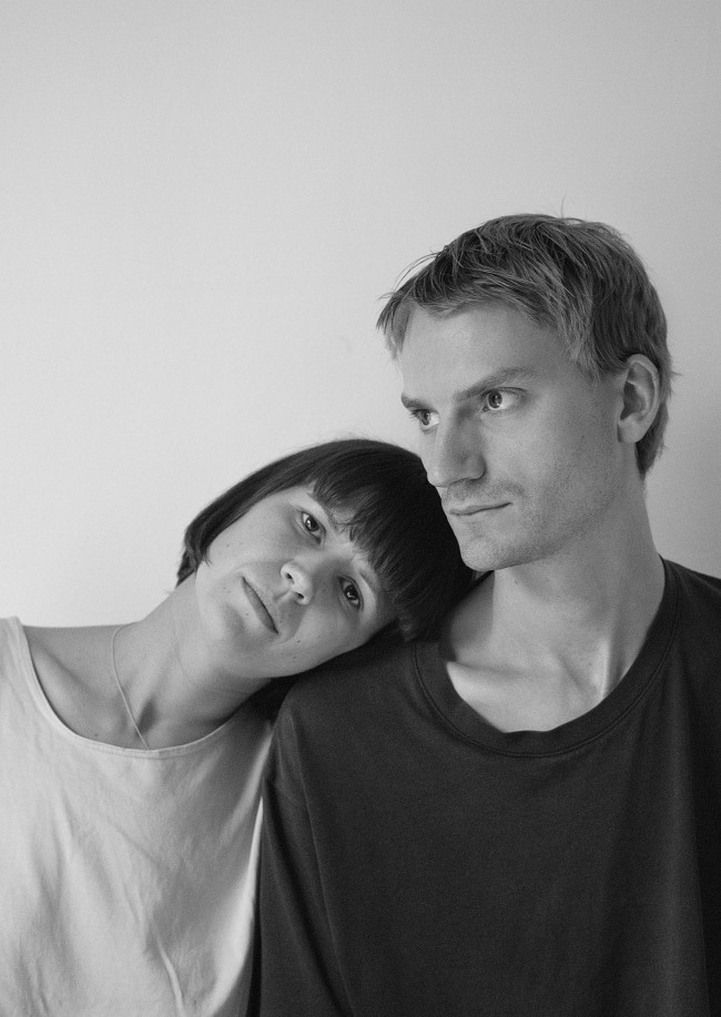
Nicholas Gardner (left) and Saša Štucin (right) of London-based design studio Soft Baroque. Photographed by Davit Giorgadze for PIN–UP.
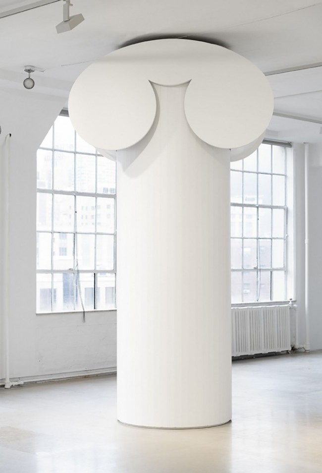
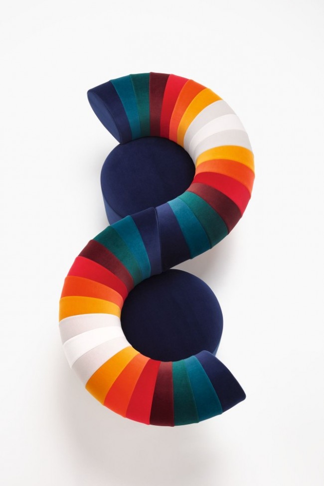
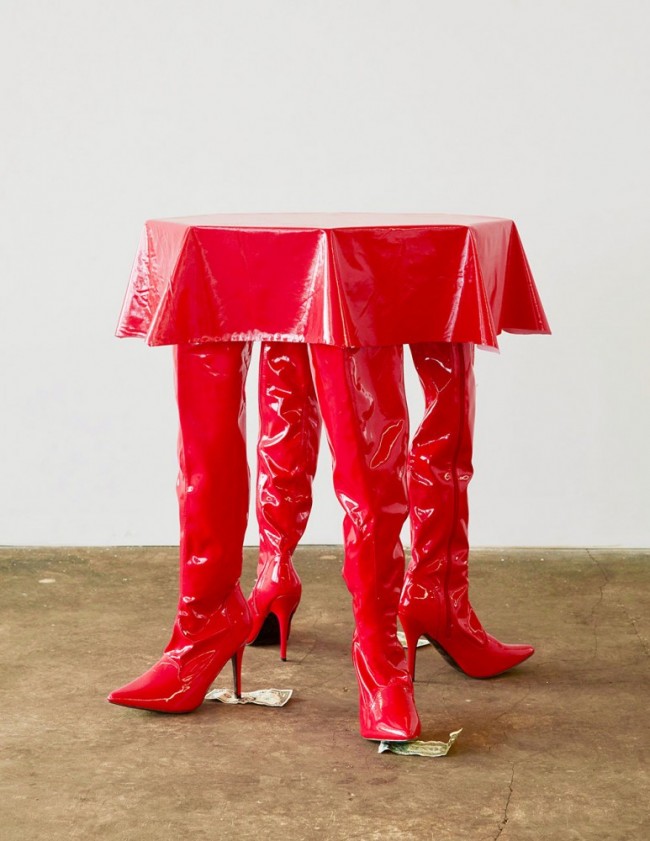
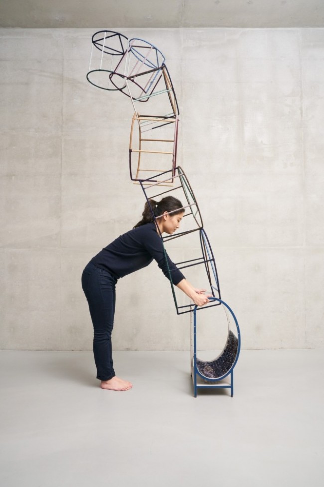
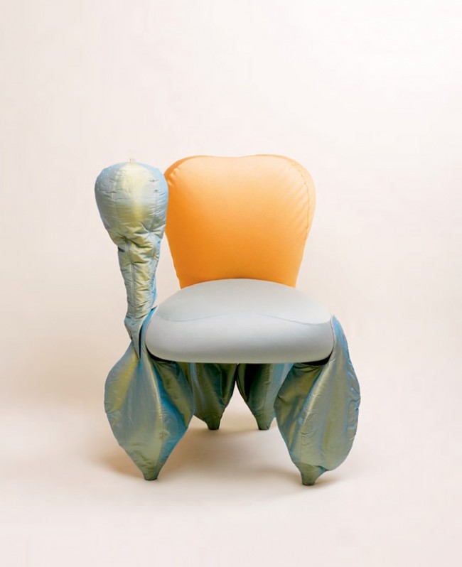
Dancing Chair (2019) is a dynamic work of furniture referencing Joseph Hoffman-type Viennese Modernism, with a motor generating movements suggesting an anthropomorphic chair struggling to get your attention.
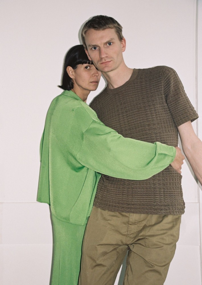
Saša Štucin and Nicholas Gardner of Soft Baroque. Photographed by Davit Giorgadze for PIN–UP.
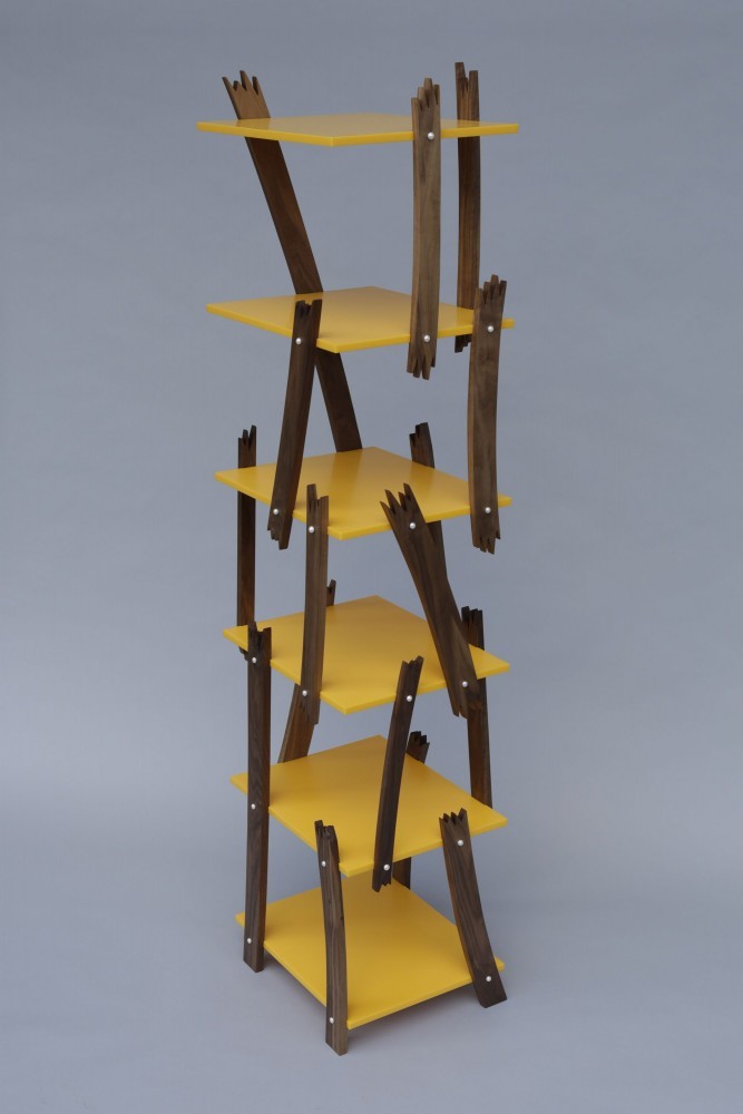
To create Purged Plastic Bookshelf (2018), Soft Baroque sourced from a recycling facility plastic in the midst of transformation, intrigued by the grotesque quality of the changing colors and polymers.

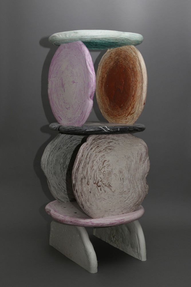
Corporate Marble series vases inside Soft Baroque’s studio. Photographed by Davit Giorgadze for PIN–UP.

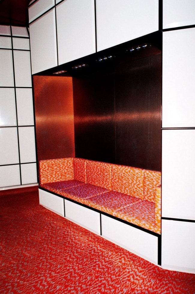
Puffy Brick (2018) is a series of works created by injecting concrete into balloons and arranging them in a mold to produce a set of perfectly-fitting concrete bricks. The counter (pictured) was a special commission for Swedish design brand HEM's temporary London location.
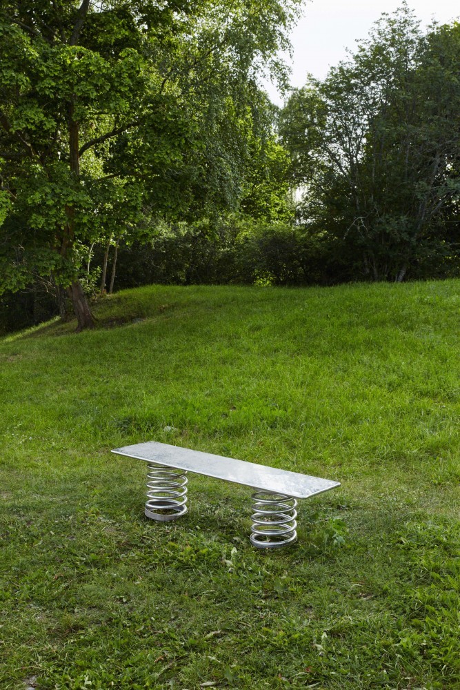
The polished stainless steel Spring Bench (2017) is a slick grown-up version of ride-on playground equipment, inspired by a YouTube video of a grown man at the park bobbing up and down on a spring rider toy for kids. It was commissioned by PIN–UP’s Felix Burrichter and curators Andreas Angelidakis and Mia Lundström as one of ten benches installed in a park in the Stockholm suburb of Järfälla for a public exhibition titled SUPERBENCHES. Photography by Henrik Blomqvist.
Soft Baroque outside their London studio. Photographed by Davit Giorgadze for PIN–UP.
Pearl Screw Shelf Bookcase (2017) draws attention to the expectation that, even in the most economical furniture construction, screws are expected to be filled, plugged, hidden, or covered. Freshwater pearl screw caps are an overcompensation commenting on collective notions of value.
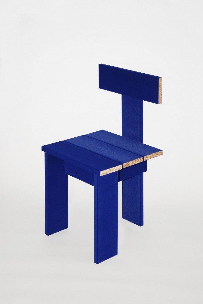
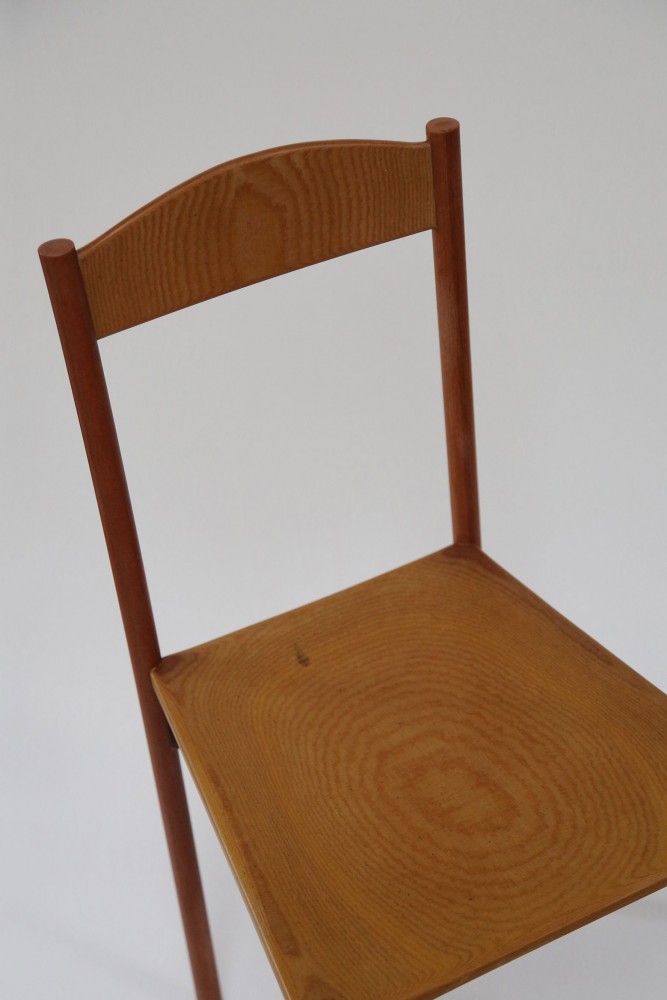
Right New Surface Strategies Chair (2015) is constructed from southern yellow pine planks flocked chroma blue, enabling the chair to absorb different material identities in digital post- production through blue screen technology.
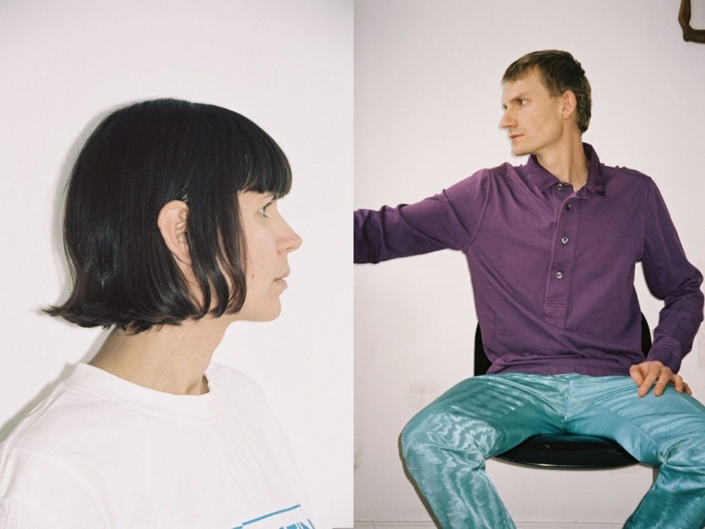
Nicholas Gardner (left) and Saša Štucin (right) of Soft Baroque. Photographed by Davit Giorgadze for PIN–UP.

The Hard Round Shelf (2019) made from Zebrano wood is part of a series manifesting in the material world a line shape derived from Photoshop’s “hard round” brush tool, underscoring a contrast between the clumsy expediency of digital image production and the patience and care inherent to 20th-century craft movements.

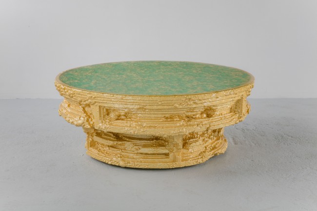
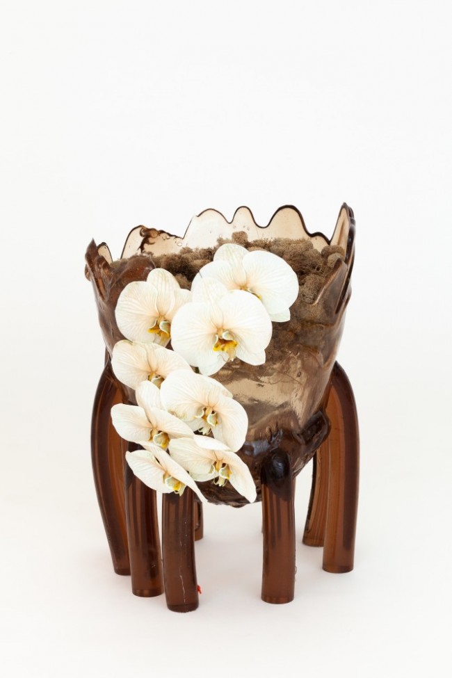
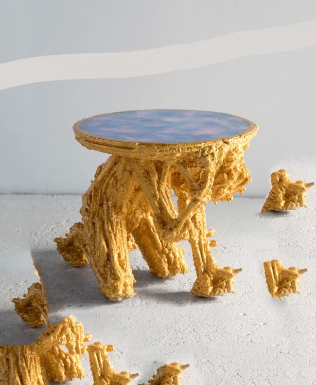
Soft Baroque’s Corporate Marble Umbrella Stand (2019) is from a series inspired by corporate foyers, the cracked and folded marble slabs suggesting the forceful use of this material known for symbolizing luxury.
Shaker-style chair made from Tufnol®, a pioneering laminated plastic that has the vague appearance of wood. The work inspires a re-evaluation of how early 20th-century plastics are being looked at with the reverence traditionally paid to natural materials.

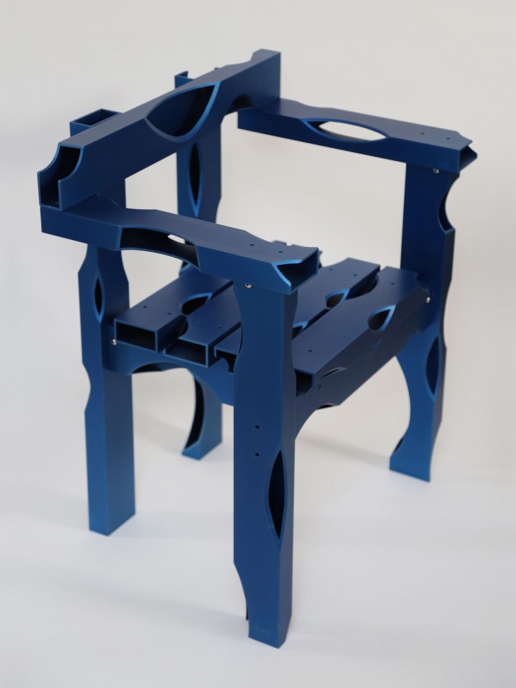
An armchair from the Carved Aluminum series (2019) uses aluminum box sections resembling 2x4 timber except for cutaways revealing they’re hollow — a technical replica of rustic primitive construction.

Soft Baroque’s first design object, Lenticularis (2014) is an oval mirror that emits a scented water particle cloud, partially obscuring the user’s reflection while perfuming the air. The concept was initially inspired by the collective human desire to replicate natural phenomena for pleasure or relaxation. The piece replicates a natural climatic occurrence which almost disables the mirror’s traditional function, and in doing so produces a new sensory experience.

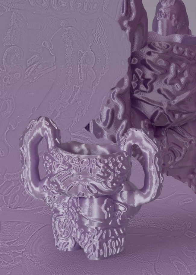
Soft Baroque’s Soft Metal Hanger (2019) is a coat hanger made from anodized aluminum and stainless steel ball, which can be freestanding or fixed on a wall. It featured in the exhibition World of Ulteriors (2019) at Etage Projects, Copenhagen, which played with blurring the boundaries of object and image.
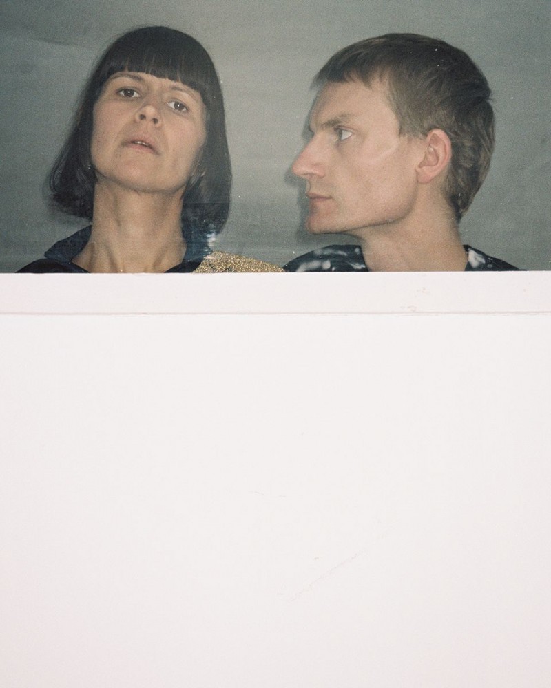
Soft Baroque photographed by Davit Giorgadze for PIN–UP.
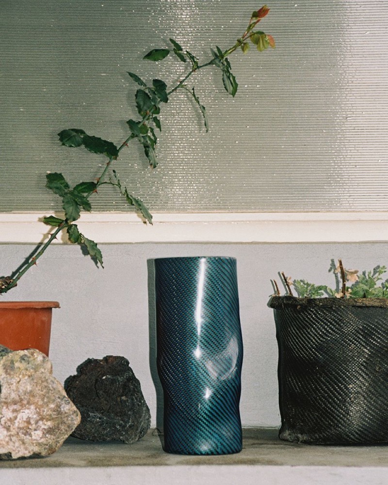
High Performance Planter made from carbon kevlar and resin inside Soft Baroque’s studio. Photographed by Davit Giorgadze for PIN–UP.
INTERVIEW: Design Duo Soft Baroque from London On Their Signature Absurdism
London-based design duo Soft Baroque are known for their fantastic functional objects which often dial up the absurdity of what’s already prominent in the consumer marketplace as a way of grappling with design’s most basic notions of value. Since they started Soft Baroque in 2013, Saša Štucin and Nicholas Gardner have found their niche playing with ideas of objecthood and perception, surface and deception. Their roving experimental approach is defined by a constant blurring of boundaries between conventional household items and conceptual art, between 2D digital images and 3D sensory material, their references spanning Home Depot gadgets and mid-century-Modern masters to IKEA furniture and digital stock photography. Slovenian-born Štucin and Australian-born Gardener, who met while they were students at London’s Royal College of Art, have shown their unconventional oeuvre at institutions like the Victoria & Albert Museum and the Swiss Institute, galleries like Copenhagen’s Etage Projects and New York’s Friedman Benda and Patrick Parrish, as well as at design fairs all over the globe. They have also taken on many direct commissions from private clients, including fashion house Balenciaga and Swedish design company HEM. In collaboration with PIN–UP, they are currently teaming up with the Venice-based leather designers Marsèll to create a project for the next Salone del Mobile. Writer and curator Jeppe Ugelvig met up with the real-life couple at their London studio to discuss their expanding practice.
Puffy Brick (2018) is a series of works created by injecting concrete into balloons and arranging them in a mold to produce a set of perfectly-fitting concrete bricks. The counter (pictured) was a special commission for Swedish design brand HEM's temporary London location.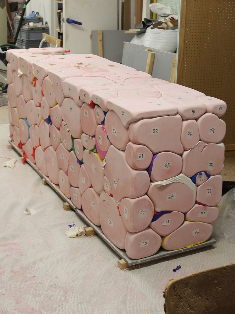
Jeppe Ugelvig: The name Soft Baroque is so evocative, but I realize I’ve never heard the story behind how you came up with it.
Nicholas Gardner: We were walking around an art fair, casually making fun of and riffing on artworks. There was this one quite traditional painting by the Slovenian artists’ collective Irwin — I can’t remember exactly what it depicted — that had these soft puffy corners, almost like padding for a frame. It set up a subtle and very pleasing clash between tradition and this unexpected softness. The idea of “soft baroque” started there, first as a joke, but then it began to resonate in our heads, relating to our vision of where the design and art worlds are headed, the taste spectrums active today, how design is positioned ideologically in the world, and where we feel we need to situate ourselves within it. So, for us, the name was a kind of formalization. We got the URL that night. We didn’t immediately talk about Soft Baroque as a collaboration between the two of us, but once we started working together, we branded the pieces under that name.
How does the name encapsulate your position in design? Or does it comment upon those around you? There’s a real tension inherent there.
Saša Štucin: It’s the tension and slight contradiction that we were first attracted to. We like the Baroque because there are so many misconceptions about it — as pure ornament or kitschy. It spoke so fundamentally about its time, and integrated all aspects of aesthetics into this total environment. I was always very fascinated by that. It’s a very modern idea.
NG: The Baroque aesthetic is very theatrical and Catholic, almost grotesque, with the depiction of the almighty in this very extreme way. We like the idea of this total dedication, a sort of capitulation to an idea or to a set of passions. It was a movement that incorporated architecture and every aspect of decoration as a total and almost divine intervention in art and design. So it’s this idea of a soft version of that — whether soft being software or soft like things being really padded, comfortable, and extremely luxurious. Comfort is like an extreme functional paradigm now — it’s almost like a religious experience to have the most comfortable chair or sofa.

Nicholas Gardner (left) and Saša Štucin (right) of Soft Baroque. Photographed by Davit Giorgadze for PIN–UP.
Soft Baroque is a creative union between your respective backgrounds in objectmaking (Nicholas) and image-making (Saša). How did the collaboration first come about?
SS: We met in school. I was studying visual communication and Nicholas was studying furniture design. And, well, Nicholas helped me build this one piece because I had no idea how to actually make it. We quickly discovered we had so much in common in terms of our material fantasies and obsessions.
Your work is specific because you emphasize the outcome of your practice being a product, some kind of functional item that has a use value and isn’t merely a speculative object. What was the first product you made?
NG: It was Lenticularis (2014), an oval mirror that emits a scented particle cloud through two holes in its face. Water vapor produced by an atomizer obscures your reflection in the mirror and perfumes your body and home with scent. It was our own hybrid of a mirror and a MUJI atomizer. We like the tension between these two elements, obscuring the reflection while introducing a new function. With a lot of our objects, we try to form a strange equation.
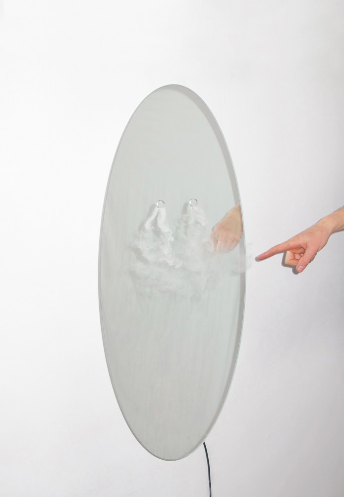
Soft Baroque’s first design object, Lenticularis (2014) is an oval mirror that emits a scented water particle cloud, partially obscuring the user’s reflection while perfuming the air. The concept was initially inspired by the collective human desire to replicate natural phenomena for pleasure or relaxation. The piece replicates a natural climatic occurrence which almost disables the mirror’s traditional function, and in doing so produces a new sensory experience.
So has this focus on objecthood — and the physical experience of objects — set the tone for your practice?
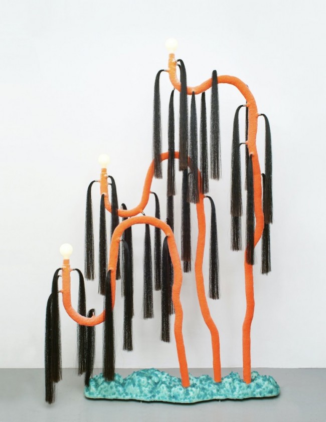
SS: We’ve definitely established some topics that repeat in our work. For myself, the reason I drifted away from image making and into object-making was that I got really interested in the human experience and how we inhabit this planet. I thought image-making was not the right tool to explore that. Our objects are these quite dynamic things. We often play with the idea of them almost having their own life, you know? Like our Dancing series of furniture (2019), for example. The second thing we’re really interested in is transplanting natural phenomena — fire, clouds, water, wind, all of that — to design. What happens when you read something natural through a very different object typology within your domestic environment?
With your work, there’s this interrogation of domestic space, and especially the experience of interiors, of living and being at home. Of course, design has always done that, but I find there’s an emphasis on lifestyle in your work. Then I find myself asking, “What lifestyle is it? Is it fantastical? Is it futuristic?”
NG: We all have a certain set of functions in our lives, afforded through objects. When those are changed or interrupted, it makes you question the validity and necessity of other common functions. We like the idea that the objects can change the way you behave, the way you think, or the way you interact with others.
So, how do your objects compare to conventional design objects?
NG: Well, I guess our ambition is for them to exist within the commercial product world, but sort of slumped, changing, and subversive. When a famous designer produces an everyday object, like a faucet or a table or a chair, they mainly just change the aesthetic either to fit into or shape the market. We’re trying to do the same, but our motives are slightly more disloyal to that system. The Soft Baroque lifestyle is an alternative lifestyle, but it’s also one that’s feeding off what’s already out there. Our Dancing furniture references common furniture, rather than creating its own crazy language completely removed from design history. The Dancing crib, for example, references Josef Hoffmann-type Viennese Modernism, while the Dancing armchair references early 2000s IKEA, which itself is derived from mid-century typologies. So what we’re trying to do is pump up these references and turn the volume down on others in order to create something that can participate in our world, without it being an artwork — it’s still a functional item.

Saša Štucin and Nicholas Gardner of Soft Baroque. Photographed by Davit Giorgadze for PIN–UP.
A functional item with an added element of fantasy — or playfulness, perhaps, a sense of humor that gestures to the horizon of contemporary design.
SS: If you look at the most modern shit on the market, it’s completely gadgety and a joke. I often refer to our work as future practical. It talks of the future, but not a distant, unknown, techy, sci-fi one. Instead one that’s referential and familiar.
You’re taking design’s rather tired claim of “innovation” to its furthest extent, actually, by innovating new lifestyles.
SS: There are millions of perfectly fine mirrors out there and we don’t see the value in us producing another fine mirror. Instead we add an extra element, which you can call humorous or futuristic, or poetic, or whatever. We sometimes see objects on the Internet, or in Home Depot, and think “Oh, that could be a Soft Baroque object” — so context matters too.
NG: Take our Dancing crib: there are already all these extremely dynamic cribs, these simulated rocking machines out there on the commercial market. Even the Dancing shelves are out there — we sort of ripped off their mechanism. But by taking one of those dynamic moving objects that claim a function or a pseudo-function, and then replacing its material or placing an aesthetic onto it — like Josef Hoffmann-type Viennese Modernism — we create something that’s kind of circular and questions existing objects.
Another big element in your practice is the interrogation of images and image culture, surface and veneers, and how the digital impacts material culture and object-making.
SS: Maybe this was an obvious starting point considering our respective backgrounds — mine more image-based, and Nicholas’s more object-based — and finding a shared interest in the flatness of an image, how thin it is. But then also how it can be manipulated to create illusions. High-resolution renders are becoming such an important part of our lives today, both on the screen but also in public space.
NG: Particularly in a big city like London — often 50 percent of a given street viewpoint comprises some sort of printed image. There’s a commercial language developing that’s driven by stock images and the representations of an ideal based on higher-resolution marketing. We’re thinking about the image as a physical thing in space. If you view an image from an angle, it looks different than viewing it straight on. Or if the poster is slightly crumpled in the light box, it produces a distorted image. We’re interested in these moments of tension between high-res representations of a reality and the actual physical infrastructure of the world. Like when somebody’s tried to wrap their image around an electrical box, and they’ve cut out a section to accommodate the function of the box. We’re trying to recreate this tension in some of our pieces: getting images and crumpling them up, or changing the shape of them. We made some furniture where we printed on the upholstery, and then the upholstery was bent and wrapped around the piece.
-
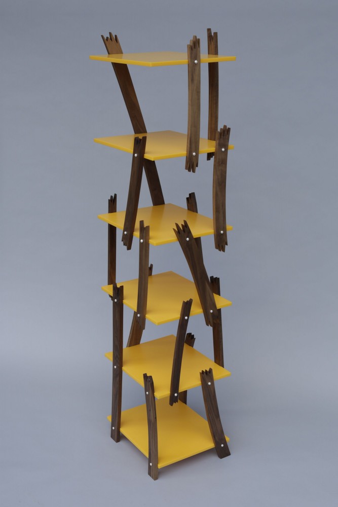
Pearl Screw Shelf Bookcase (2017) draws attention to the expectation that, even in the most economical furniture construction, screws are expected to be filled, plugged, hidden, or covered. Freshwater pearl screw caps are an overcompensation commenting on collective notions of value.
-

To create Purged Plastic Bookshelf (2018), Soft Baroque sourced from a recycling facility plastic in the midst of transformation, intrigued by the grotesque quality of the changing colors and polymers.
-
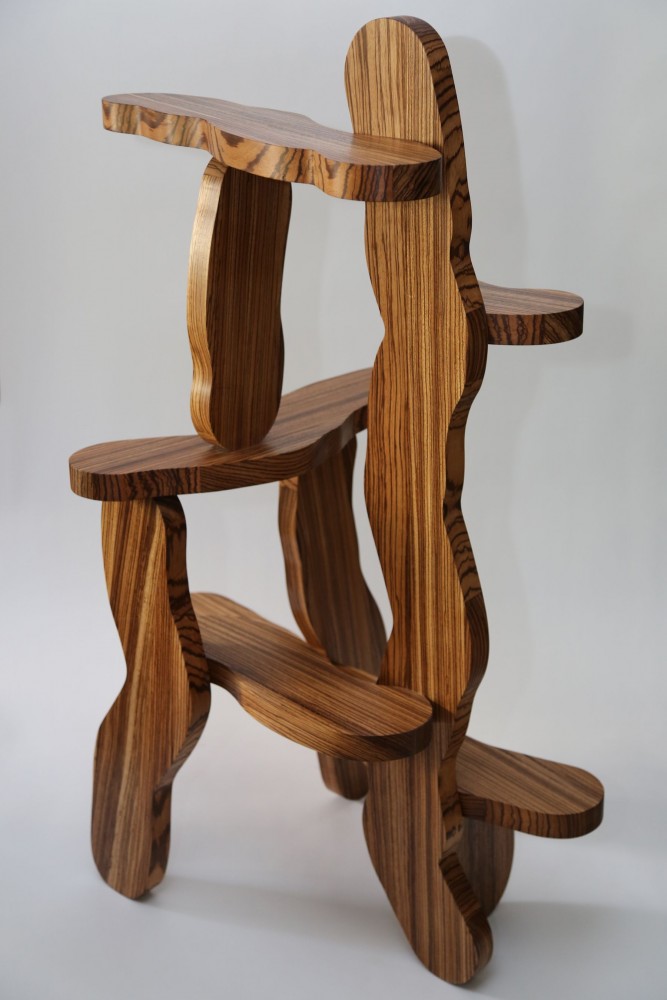
The Hard Round Shelf (2019) made from Zebrano wood is part of a series manifesting in the material world a line shape derived from Photoshop’s “hard round” brush tool, underscoring a contrast between the clumsy expediency of digital image production and the patience and care inherent to 20th-century craft movements.
-
An armchair from the Carved Aluminum series (2019) uses aluminum box sections resembling 2x4 timber except for cutaways revealing they’re hollow — a technical replica of rustic primitive construction.
Last year, you had an exhibition at Etage Projects called World of Ulteriors, which used backdrops in this way.
NG: Yes, we worked with a friend of ours, the architect Nicholas Ashby, to make backdrops to present the work on. They were large PVC banners printed with architectural renders of interiors, similar to advertising renders on the hoardings of half-built developments, which are usually grotesquely and abundantly furnished. Nicholas’s are unfurnished spaces that reference 2000s Australian harbor-side condo developments and Italian palazzos. The banners were hung at an angle, half draped across the floor, or bunched up, which produced a 3D physical distortion in space of a 2D digital image, contrasting their flatness with the 3D objects placed on or in front of them. When images of the installation circulated online, it was hard to tell the relationship between the 2D banners and the 3D objects — it looked photoshopped or confusing. We like to play with that confusion. We’re talking about how design and architecture are consumed now — the image is as much a product as the real space. Our furniture is unashamed about inhabiting that digital product.
SS: The digital representations of ideal and desirable spaces have driven us to strange tastes. Large-format prints of juicy droplet-spangled tomatoes confront you walking past a supermarket. Construction sites are covered in tarps printed with a graphic version of the building that’s being restored. Printed wood grain on laminates for flooring or furniture has become more and more hyperreal and verging on the psychedelic. It’s a strange mix of deception and decoration. In World of Ulteriors, we were creating a series of objects that both participate in and subvert these phenomena. The fetishization of high-performance materials in combination with luxury tropes is at once an example of digitally assisted free-market feedback loops gone awry and of genuine expressions of our natural desires.
-

Right New Surface Strategies Chair (2015) is constructed from southern yellow pine planks flocked chroma blue, enabling the chair to absorb different material identities in digital post- production through blue screen technology.
-
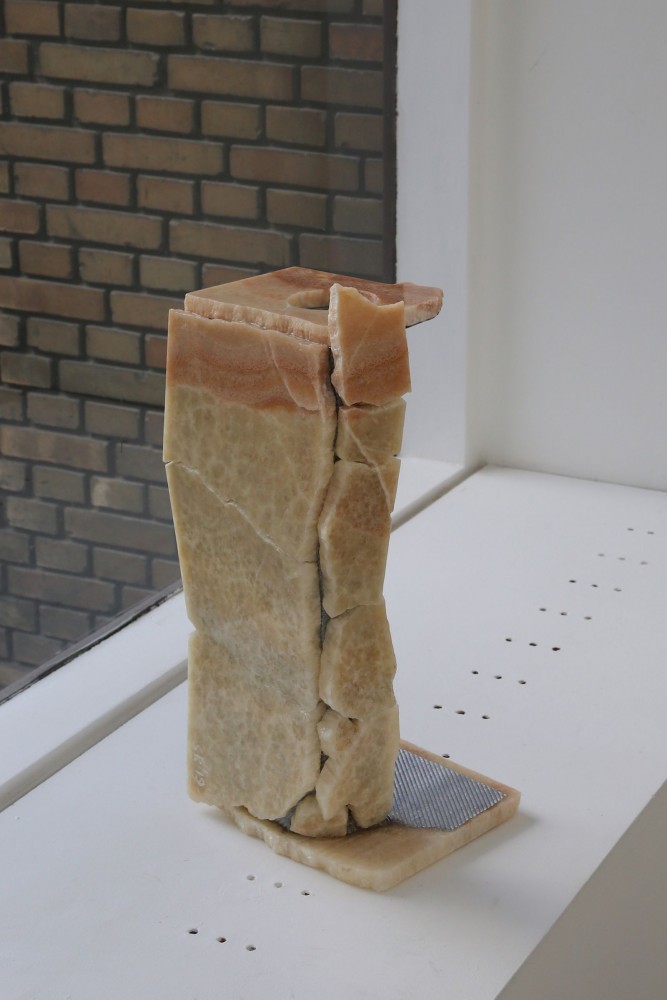
Soft Baroque’s Corporate Marble Umbrella Stand (2019) is from a series inspired by corporate foyers, the cracked and folded marble slabs suggesting the forceful use of this material known for symbolizing luxury.
-
Shaker-style chair made from Tufnol®, a pioneering laminated plastic that has the vague appearance of wood. The work inspires a re-evaluation of how early 20th-century plastics are being looked at with the reverence traditionally paid to natural materials.
-
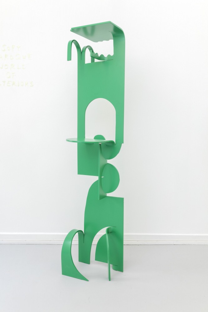
Soft Baroque’s Soft Metal Hanger (2019) is a coat hanger made from anodized aluminum and stainless steel ball, which can be freestanding or fixed on a wall. It featured in the exhibition World of Ulteriors (2019) at Etage Projects, Copenhagen, which played with blurring the boundaries of object and image.
Does the digital pose a threat to object design?
NG: The Instagram version of the digital is a threat, I think. People are becoming lazier and putting less effort into making projects that are well-rounded. Rather they make it just for the image, ticking the boxes in terms of what will be liked on Instagram.
I like that you think about the circulation of images in that way, and a part of the confusion and joy in encountering your objects in the flesh is that they feel almost like digital-born objects. Your ongoing Puffy Bricks project, which you began in 2018, looks like something that could be found on Tumblr, a speculative image of an object that didn’t exist. And yet it’s real.
SS: I think this feeling relates to surface and deception — the methods of production of surface, or production of material, as a means of selling or deceiving. In a weird way, there is a dominance of surface that has taken over a lot of plastic items — for example, regular furniture items printed with wood grain or stone. We like that topic and we try to think about it as much as possible because it’s so prominent in the consumer market. Even Apple does it. We don’t necessarily mind it, we just think that if you’re going to print wood grain, then why can’t you also print something else? Why can’t you explore this in a more experimental fashion?
Experimentation seems to be the driving force of Soft Baroque. As a result, you don’t have a house style like most contemporary design practices. The intervention, the question, is the red thread. This is maybe both a blessing and a curse, from a commercial viewpoint at least.
NG: A lot of the time, I think we have an urgency to do something new. I remember, in the first few years, interior designers were really curious about our practice but concerned about not knowing how to sell us to clients because our result is so different every time. Most people specialize in one material, process, or typology, and then go from there. We are more interested in setting up an ideology and being responsive within that. But to be honest, we don’t know what we’re doing exactly. I have pangs of commercial urgency, thinking we should do proper collections and catalogues, but that feeling never lasts and we return to the project-by-project model. Soft Baroque wasn’t set up as a business model, it was set up as a conversation between the two of us. It was a weekend project for the first four years, and we have only been running Soft Baroque full time for just over a year. We’re always a bit restless. Things seem to work best when we’re moving fast.

Soft Baroque outside their London studio. Photographed by Davit Giorgadze for PIN–UP.
How has your practice evolved over the years to become more spatial?
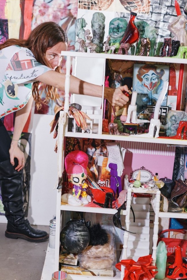
SS: When thinking about how or where to place our objects, we are naturally drawn to total spaces, usually distorted versions of domestic interiors. However, our starting point is generally the objects — the rationality for the space comes as a consequence. What is the reason for this object’s existence? What does the material we are using say? Then that story starts forming as a room. I guess this is the reverse of how a conventional interior designer would work. Stylistically, we’re a little bit disenchanted with what’s filtering through domestic design culture right now: we find tasteful Postmodernism nauseating, even though we’ve been proponents of it at times. We are trying to move into in-depth projects where we work collaboratively with other artists and curators, work which manifests itself in experimental spaces sometimes separated from the commercial.
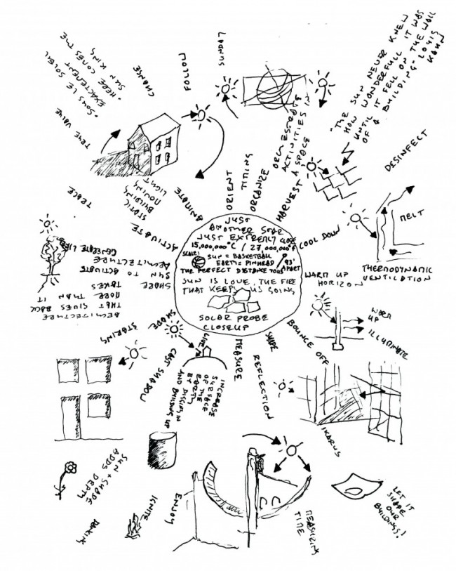
One of these more in-depth projects is going to be an installation you’re planning with PIN–UP and Marsèll in Milan in 2021. Can you already talk about the concept behind it?
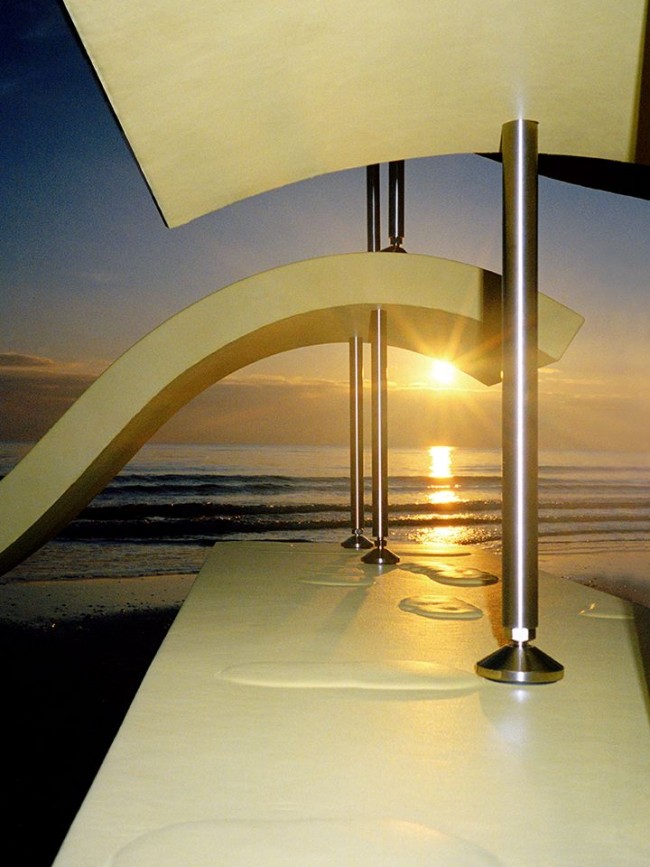
NG: It’s still very early, but right now we’re focusing on three aspects of the sun: growth, worship, and destruction. I guess we took a more cynical approach to growth, with artificial sunlight referencing grow-op farms (indoor marijuana plantations) for which we’re designing our own versions of consumer furniture illuminated from the inside. It’s very technical and scientific, maybe suggesting how we’ve lost touch with nature. Worship is about a religious experience and about making a space for relaxation — we’re making these brass relics and presenting objects that reference Quaker and Shaker traditions. And for destruction, we’ve designed sun benches that look like they’re melting. They’re loungers, but they can also be stacked on top of one another to make a superstructure.
SS: Growth talks about life, energy, and technology. Worship references the sometimes-antithetical forces of craft, industry, style, and religion. And lastly, with destruction, we’re thinking about the sun as a beloved enemy. It will be our personal response, interwoven with ideas about design and consumer culture. But, more broadly, we’re commenting on how, due to our dependency on hydrocarbons, we’ve lost our reliance on the sun’s power. But now we will need it again, so let’s look directly at it!
Interview by Jeppe Ugelvig.
Portraits by Davit Giorgadze. Work images courtesy Soft Baroque.
Taken from PIN–UP 28, Spring Summer 2020.


